01What is Swapplet?
Swapplet is a digital bank account based in Panama that gives people in South America somewhere to hold and move US dollars. In a region where people save in dollars and spend in local currency, that is not a feature on a list. It is the reason to open the account.
The account is opened entirely from a phone, from another country, with a passport. That is the whole promise in the film above, and it is also the whole design problem: everything a branch would normally do has to happen in one flow, on one screen, for someone the bank has never met.
02Overview
It was built at N5 Now, the company I worked for at the time, for their client. I was the Product Designer on the onboarding: the part where a bank either gets a customer or loses one.
This is a financial product, so the whole project sits under an NDA.
Outcomes
- Sign up conversion went from 17.55% to 46.32%, measured on the onboarding that had already shipped against the one I rebuilt. Slightly more than one in six people finished before. Slightly less than one in two finished after.
- Onboarding time dropped 32%, with identity verification inside the same flow.
- Around 460 accounts opened through the app, out of more than a thousand downloads.
Full process
The Problem
Opening a bank account online is where banks lose people. It asks for a passport, a selfie, an address, a salary range and a signature, and every one of those is a place to give up.
So we measured what the market was asking for. Twelve banks, counted click by click, from the first tap to a usable account. The best did it in 24. The worst took 120.
Swapplet had to land at the good end of that chart while collecting everything a regulated bank in Panama is required to collect. Those two things pull in opposite directions, and that tension is the whole project.
The Opportunity
How might we open a dollar account for someone in South America without asking them to fly to Panama?
How might we ask for a passport, a selfie and a signature without it feeling like an interrogation?
My Role
Product Designer on the onboarding, from research through delivery, with the Product Manager, the engineers and design reviews with the Lead Designer. The project ran for about three months.
The Team
- Product Owner: Claudia Bello Peralta
- Product Manager: Yorcelys Aguilar
- Lead Designer: Gonzalo Fasce
- Product Designer: Wagner Henriquez (myself)
03Discover
Twelve banks, counted click by click
We did not ask banks how their onboarding felt. We opened an account at each one and counted the taps.
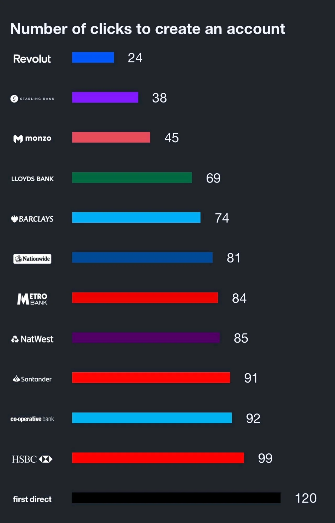
The chart splits cleanly in two. The neobanks sit between 24 and 45. The traditional banks start at 69 and run to 120. Swapplet was being built by a traditional bank, and the target had to be the other half of the chart.
The number that mattered was not the average, it was 120. First direct asks for a hundred and twenty taps before you have an account. Any one of those is a place to close the app, and nobody closes an app at tap three.
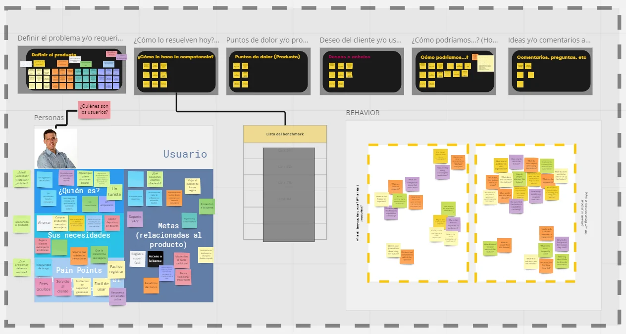
The research pointed the same way from the other side. The pain points on that board are not about features. They are hidden fees, doubts about whether the app is safe, and support that does not answer. And what people wanted was blunt: save in dollars, pay suppliers in dollars, travel without carrying cash.
The account was the means, never the point. That is why nothing in the onboarding tries to sell the bank.
And the two people behind those notes are not banking customers in the usual sense. One is a traveller who does not want to carry cash. The other runs a small business and pays suppliers abroad. Neither of them wants a bank. They want the dollar to still be a dollar when they spend it.
04The decision
One pass, and a number to beat
Two options were on the table. Split the onboarding, so the user gets in fast and finishes the paperwork later. Or keep it in one pass and make the pass short.
We kept it in one pass. A bank account you cannot use yet is not an account, and a half verified user is a support ticket waiting to happen. So everything stays in a single flow: register, verify the email, verify the phone, scan the passport, take the selfie, add profession and salary range, accept the terms, sign, set a password.
What I gave up: the early win. There is no moment near the start where you see a balance and feel done. It is paperwork until the end, and the only thing holding you is knowing how much is left.
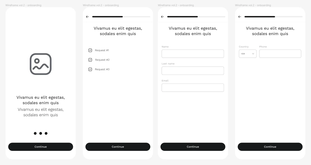
Which is why the progress bar is not decoration. It is on every screen, and it is the promise that this flow ends.
Counted the same way we counted everyone else, the happy path is about 40 taps. On that chart it lands between Starling and Monzo, and ahead of every traditional bank on it.
The two prototypes we built to test it are still open: the mobile flow, which is the one that shipped, and the desktop version. You can click through either one.
05Design
The flow that shipped
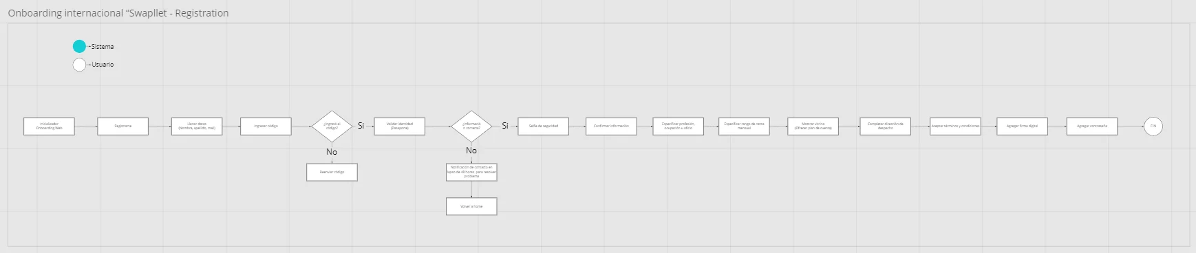
Two things in that diagram are worth stopping on.
It only branches twice. Did the code arrive, and is the information correct. Everything else is a straight line. A regulated onboarding wants to branch on every field, and every branch is another screen to design, build and then support.
One constraint shaped more of this than it looks. The identity check is not ours. It is a third party service, and the interface had to bend to whichever one the bank picked: what it asks for, in what order, and what it hands back when it fails. Designing around a component you do not control means designing the states, not the screens.
And when the automated check gives up, there is a person. The box says the user will be contacted within 48 hours to solve the problem, and it sends them back to the home screen with the account still there.
Every identity check has people the machine cannot read. Most products leave them pressed against a Try again button. Naming a human, with a number of hours attached, costs one box in a diagram.
Writing it for more than one Spanish
The app is used across South America, and Spanish is not one language once you cross a border. The everyday words for money, for a card and for a fee change from country to country, and a word that sounds neutral in one place sounds wrong in another.
In an onboarding that matters more than it sounds, because the person is deciding whether to hand over a passport while they read it. So the copy leans on plain verbs and on what the screen is asking you to do next, rather than on local banking vocabulary. It is the least visible work in this project and the part that went through the most rounds.
06Testing
Thinking aloud, twice
We tested the flow twice with people who matched the target. First on low fidelity wireframes, to find out whether the order of the steps made sense at all, and again on the high fidelity prototype, to find out where people actually stopped. Both rounds were think aloud, with a short survey after each session.
The findings themselves are under the NDA and are not in this case. That is the weakest part of the evidence here and I would rather say so than dress it up: you can see the flow that shipped and the number it produced, but not the sessions that shaped it.
07Project outcomes
The conversion
Sign up conversion went from 17.55% to 46.32%. Before, slightly more than one in six people who started an account finished it. After, slightly less than one in two.
To be exact about what the before is: there was no earlier product to replace. Swapplet was built from nothing, it launched, and its first onboarding converted at 17.55%. What this case shows is the second one, which I rebuilt on the back of that number. So this is not an old bank measured against a new one. It is my own first attempt measured against my second, on the same product, the same market and the same legal requirement to hand over a passport. Nothing changed except the onboarding.
Onboarding time dropped 32%, and around 460 accounts were opened through the app.
Those are two different numbers and it matters which is which. The download count on Google Play is public and anyone can open it. The accounts are fewer than the downloads, because that gap is the thing this whole case is about: people who install a bank and never finish opening the account.
The conversion number is the one I care about, because it is the one nothing else explains. Same product, same market, same legal requirement to hand over a passport. What changed was how many taps it took and whether you could see the end.
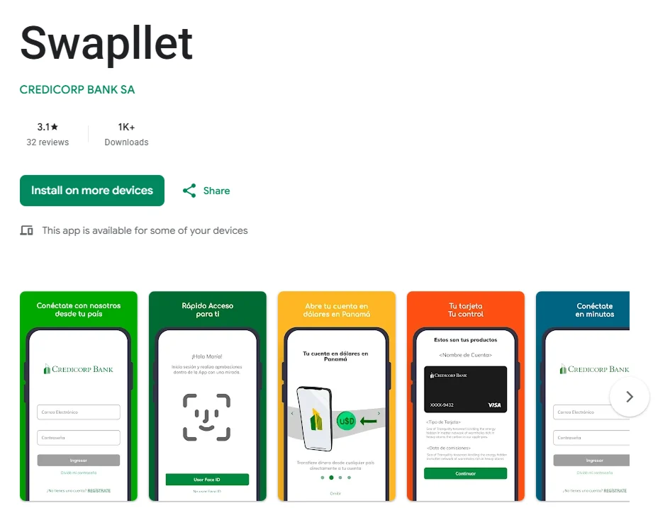
A note from 2026: when I shipped this, it was close to five stars.
08What I learned
Three things I took from this
1. Count, do not estimate. Everyone on the project agreed the competition was slow. The benchmark turned that into 24 against 120, and a number is something a room can argue with. It is the cheapest research I have ever run and the one that moved the most.
2. The regulation was the brief, not the obstacle. The passport, the selfie and the signature were never going away. Treating them as fixed is what forced the real question, which was not what to remove but how few taps each one could cost.
3. The failure path deserves a designer. The 48 hour fallback took one box in a diagram and one screen to build, and it is the difference between a customer who is lost and one who is delayed.
09Shipped
It shipped, and it is still listed
Swapplet went out on both stores and the listings are still up, with more than a thousand downloads on Google Play. What is in this case is not a mockup and not a prototype: it is the flow that shipped, which is the only kind of proof I trust in a portfolio.

Everything shown here is what the NDA allows: the flows, the wireframes and the shipped app, which is public on both stores.