01Overview
Nilo is a digital wallet built for South America. It holds cards and bank accounts, sends and receives money, and does the thing that actually matters in the region: it converts US dollars into local currencies. In a market where people hold savings in dollars and pay rent in pesos, that exchange is not a feature on a list. It is the reason the app exists.
I joined as Lead Designer to design it from nothing, and shipped a prototype of 122 screens in four months.
This is a financial product, so the whole project sits under an NDA.
What I can show you
- The prototype is public and it works. 122 screens, still live in Figma. You can open it and walk the whole product yourself, which is more than most case studies will give you.
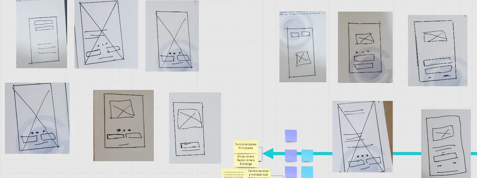
- The flows include what happens when things break. Both flowcharts here carry their failure paths: a passport that will not scan, a selfie in bad light, an email that is not in the database.
- It was tested on a real device. Not clicking through on a laptop: a phone, in a hand, on a sofa.
What I cannot show you: numbers. This was a four month contract to take Nilo from zero to one, and it ended at launch, so I never saw adoption, retention or conversion. If a case study without metrics is a dealbreaker for you, that is fair, and this is the honest version of it.
Full process
The brief
Design a wallet from scratch: registration, cards and bank accounts in one place, payments, sending and receiving money, currency exchange, and the security a product holding people's money has to have. Four months, for young adults across South America who already run their financial lives from a phone.
The hard part was never the feature list. It was that a wallet has to satisfy two people at once who want opposite things. The regulator wants to know exactly who you are before you move a cent. The user wants to be inside the app in thirty seconds. Most of the decisions below are that tension being resolved one screen at a time.
My Role
Lead Designer. I owned the UX and the UI, working with one other designer, and with the Product Owner, the Product Manager and Head of Technology. I ran the research planning, drew both flowcharts, built the prototype and ran the device testing. Four months end to end.
The Team
- Product Owner: Eli Ramirez
- Product Manager: Maria Eugenia Torres
- Head of Technology: Juan Scrocchi
- Lead Designer: Wagner Henriquez (myself)
02Discover
Sorting the questions before asking them
Before any research ran, I put every question the team had onto one board and mapped it on two axes: what people say against what people do, and what you can count against what you have to watch. Four quadrants, and each one answers to a different method. A question about fear belongs in an interview. A question about percentages belongs in analytics. Asking either one the wrong way gets you an answer you cannot use.
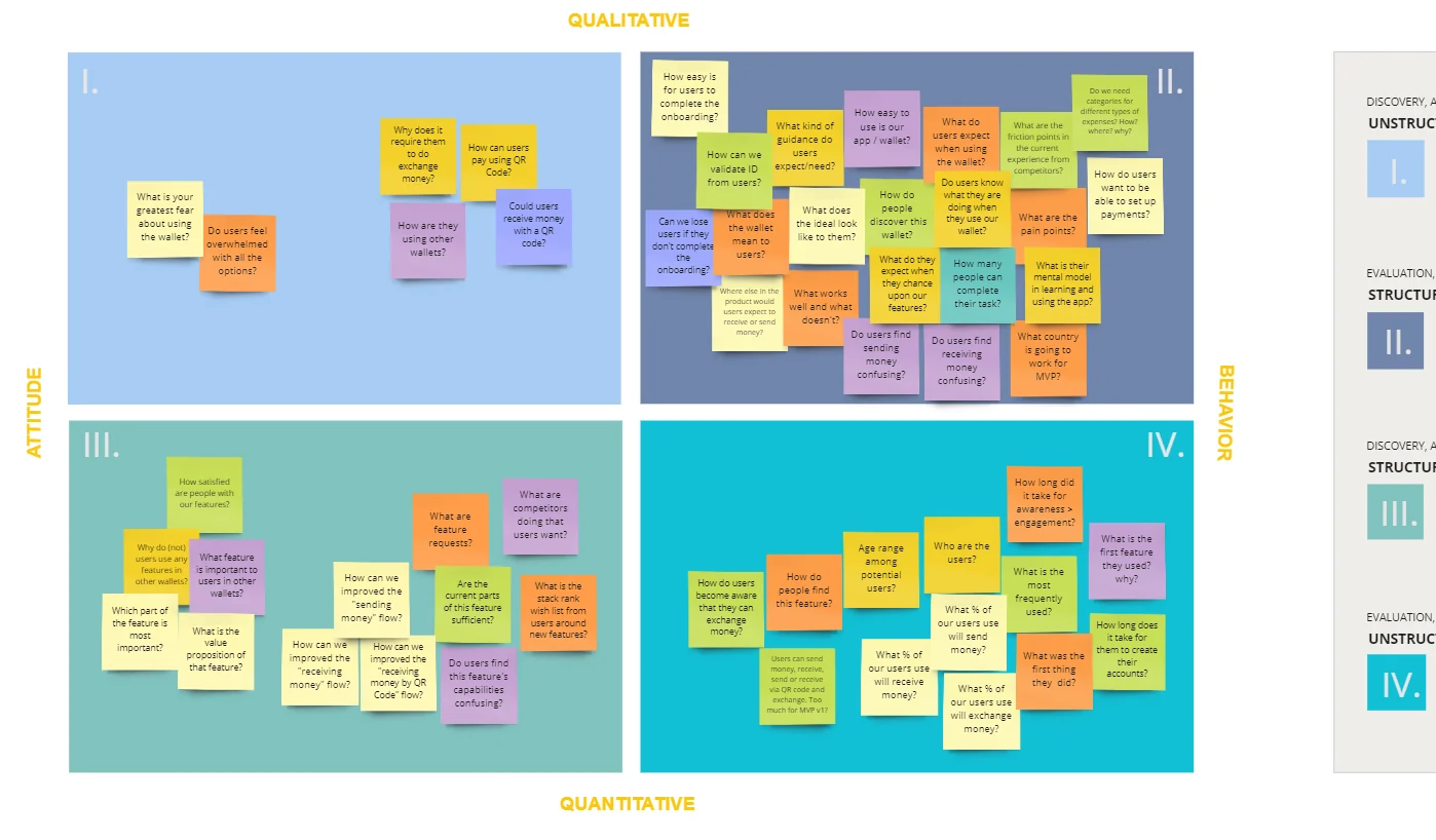
One sticky note decided more than the rest of the board. In the behavioural quadrant, next to the onboarding questions, sat this:
"Can we lose users if they don't complete the onboarding?"
From the research board. The answer, for a wallet that asks for a passport, is obviously yes.
There was a second one I kept coming back to, on the same board: "Users can send money, receive, send or receive via QR code and exchange. Too much for MVP v1?" Writing that down was uncomfortable. Leaving it on the board where leadership could read it was the point.
03The decision
Do not ask for a passport to open an account
The obvious build is one onboarding: sign up, verify your identity, you are in. It is what the compliance requirement literally says, and it is what most wallets do.
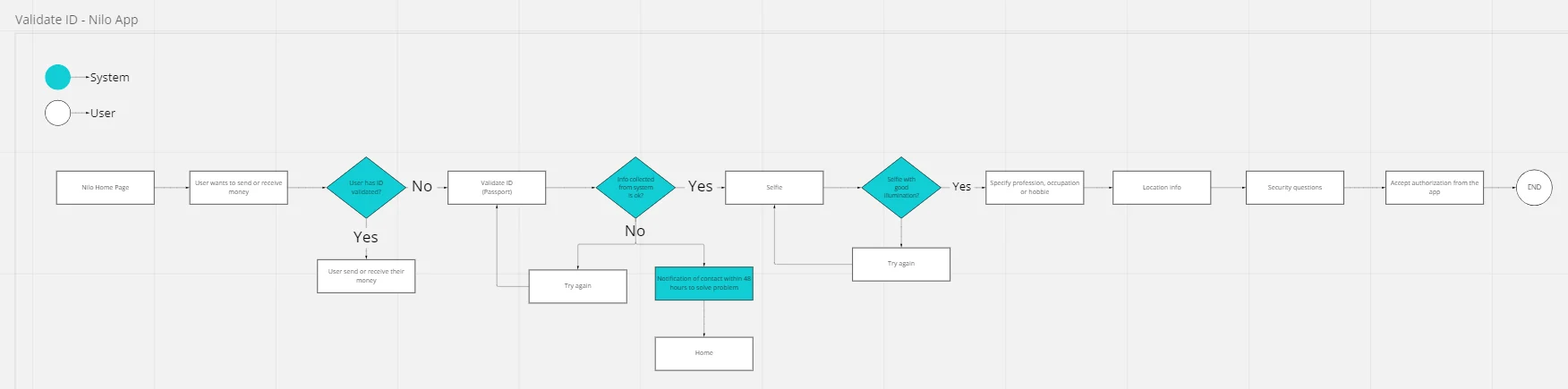
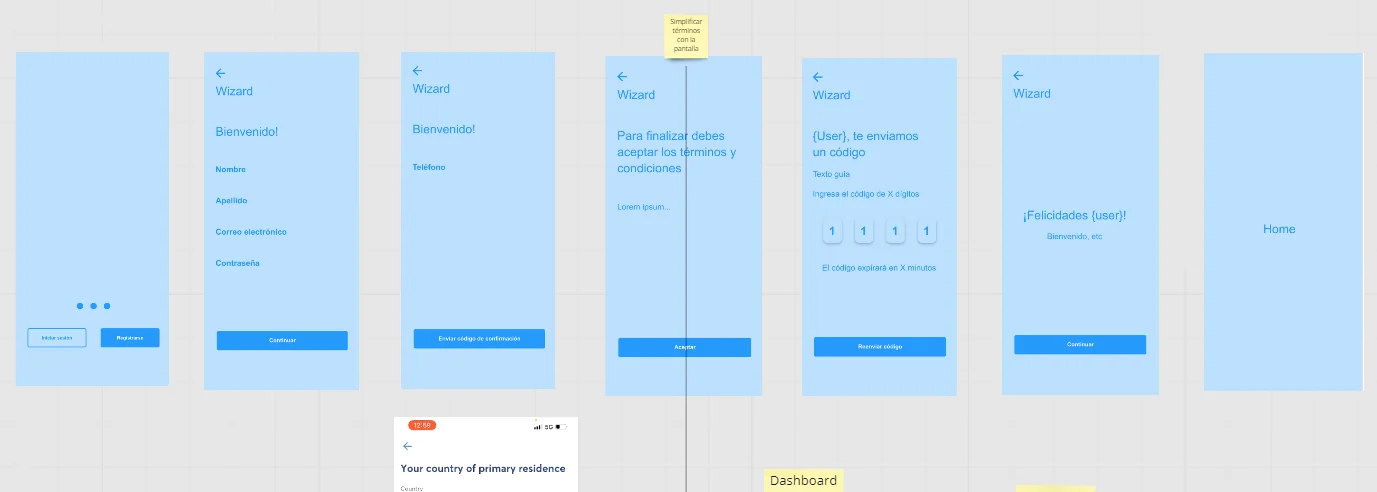
I split it in two, and the split is the whole design. Creating an account asks for a name, an email and a password. That is it. The passport, the selfie, the address and the security questions only appear the moment you try to send or receive money, because that is the moment the regulation actually applies.
The reasoning is in that sticky note. Identity verification is the single most abandoned step in any fintech signup: it needs a document you may not have in the room, decent light, and trust in an app you have used for nine seconds. Putting it before the user has seen anything means asking for the maximum at the moment they owe you the least. Put it after, and the ask arrives when they already want something.
What it cost: a population of accounts that exist but cannot transact, which is a support problem and a metric that looks bad on a dashboard. I took that trade because an unverified account can still be persuaded. An abandoned signup cannot.
Designing the part that fails
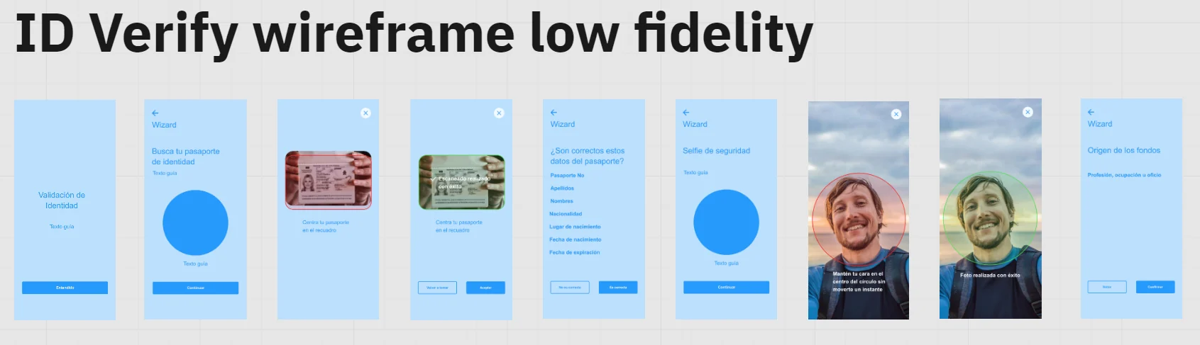
A passport scan works perfectly in a design file and badly in a kitchen at night. So both flowcharts spend more space on the failures than on the happy path.
Bad data off the passport sends the user back to try again. A selfie in poor light says so and sends them back to try again. And when the system simply cannot read the document, the flow does not leave the user stuck in a loop. It tells them someone will contact them within 48 hours, and returns them to the home screen with an account that still exists. That is not a box in a diagram, it is a screen that got written:
"We understand that you have a problem. We will contact you via email within 48 hours. Thank you and sorry for the inconvenience."
The screen a user meets when the automated check gives up. It appears near the end of the walkthrough below.
That box is the one I would defend hardest in this whole project. Every KYC flow has users the automated check cannot process, and most products leave them pressed against a wall with a Try Again button. Naming a human fallback, with a number of hours attached, costs one box in a diagram and is the difference between a lost customer and a delayed one.
04Ideation
Paper first
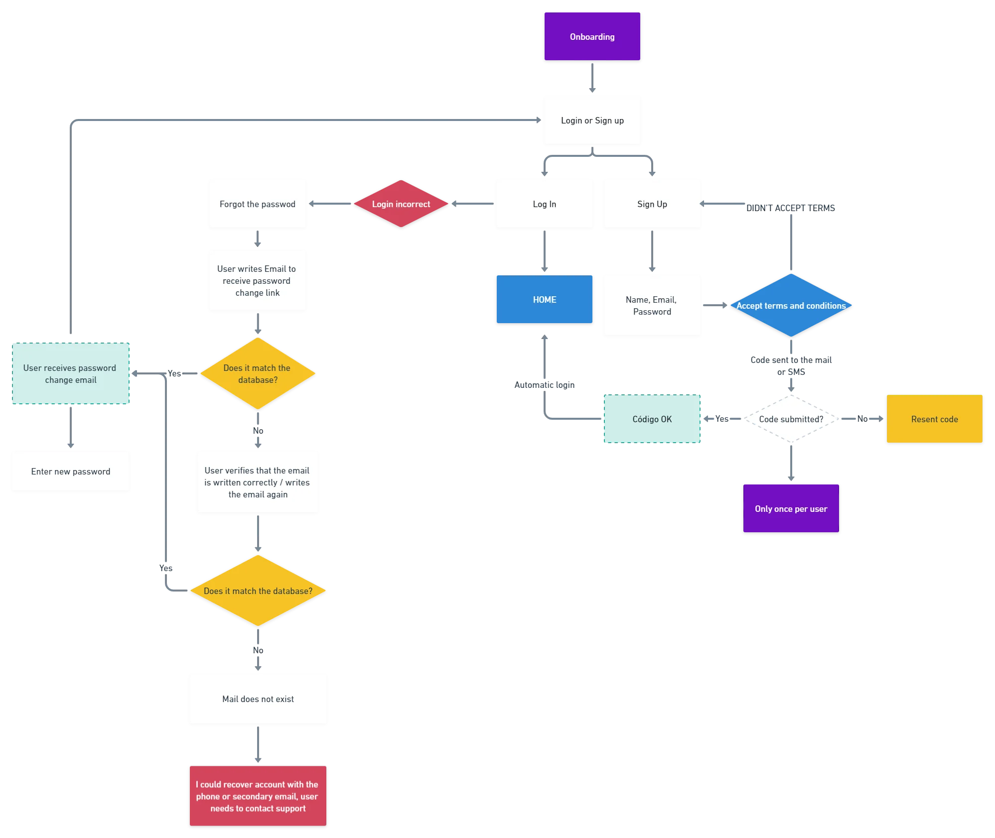
Four things had to survive from paper to build: account creation, a home screen that opens on your balance, a payment path that never makes you hunt for the send button, and settings that stay out of the way. Everything else was negotiable.
05Before and after
The first version
This is the first UI, and it is a perfectly reasonable wallet.
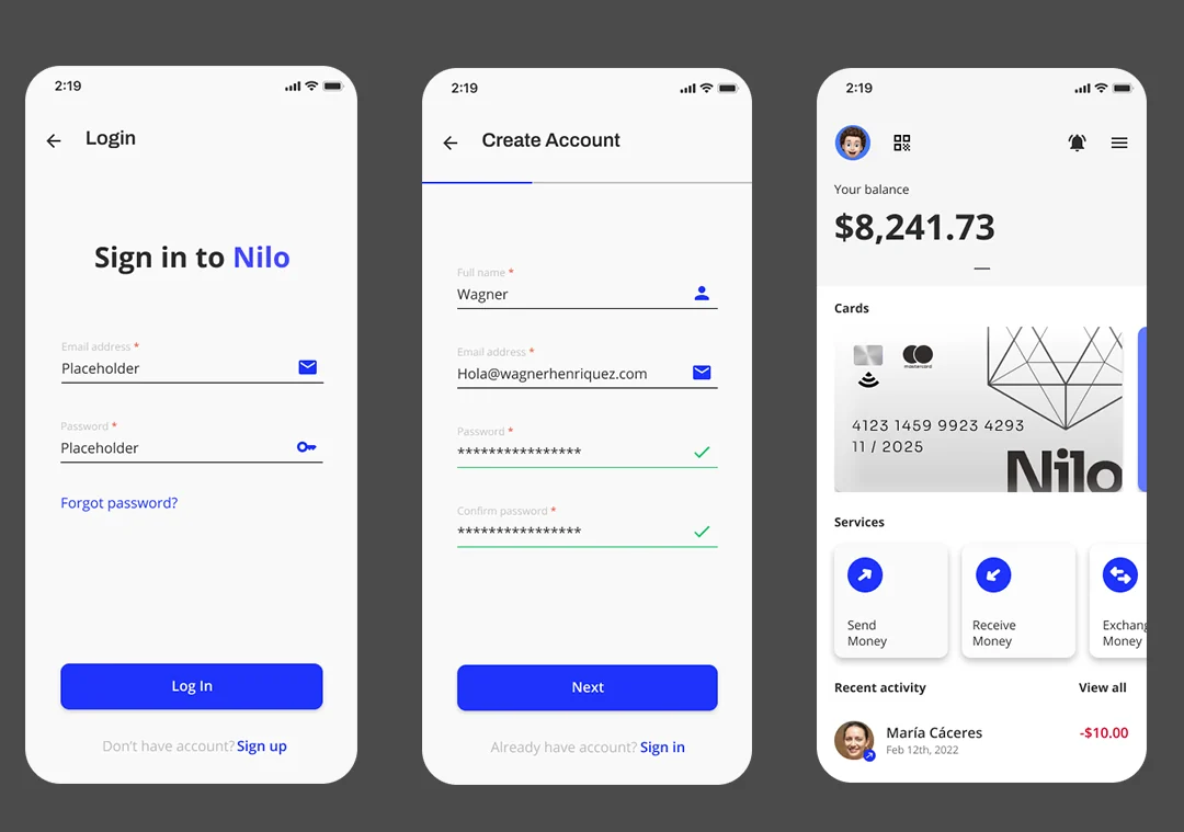
Feedback from users and stakeholders pushed it somewhere else, and calling that change "we went dark" undersells it. Three things moved at once:
- Cards became wallets. A single card turned into a carousel, because the product's whole point is holding more than one currency. Version one showed dollars. Version two shows you have dollars and pesos before you tap anything.
- Three actions became four. Scan joined Send, Receive and Exchange as a peer, not as something buried in a menu, because in South America a QR code is how you pay a person standing in front of you.
- Dark went from a decision to a setting. It is a toggle in Settings, not an aesthetic I imposed on everyone.
06Testing
A real phone and a real thumb
Prototypes lie on a laptop. Every tap is precise, nothing happens with one hand, and no permission dialog ever interrupts you. So the prototype went onto a phone and got used the way a phone gets used.
That is where the iOS camera permission dialog stops being a rectangle in a flowchart and becomes a real decision a real person makes badly, right in the middle of identity verification, with a Don't Allow button sitting next to OK.
07The system underneath
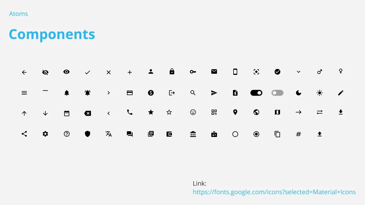
Colour, type and icons
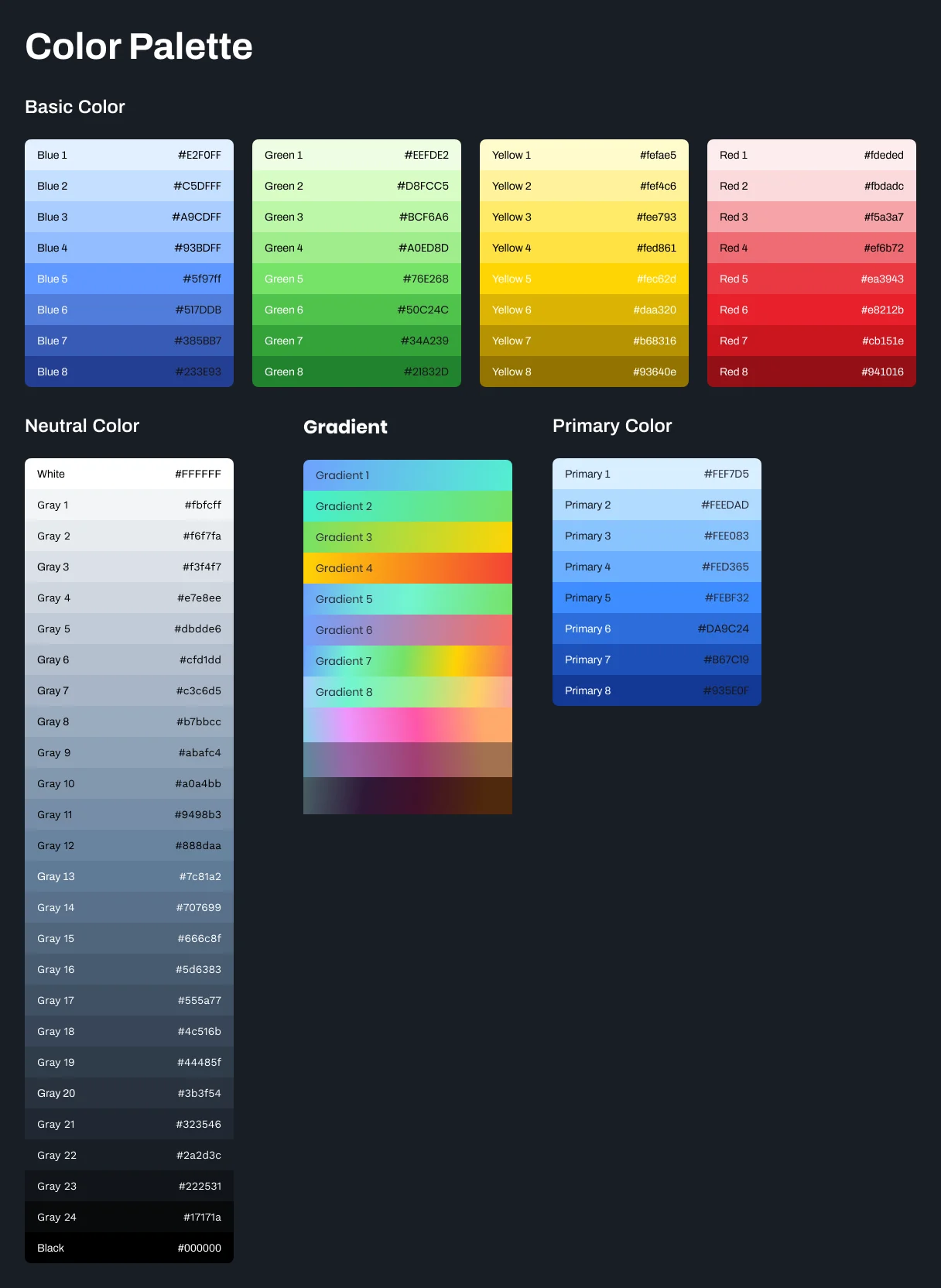
A wallet is asked to look trustworthy and feel quick at the same time, and those pull in opposite directions. The style guide is where that gets settled once instead of being argued again on every screen. Contrast ratios follow W3C guidance, which in a dark interface handling money is not a checkbox: it is whether someone can read their own balance in sunlight.

08What I learned
Three things I took from this
- Sorting the questions is doing the research. Half the value came before anyone was interviewed, from separating what people would say from what they would do. It stops you interviewing your way to a number, or measuring your way to a feeling.
- Compliance is a design brief, not a wall. The rule said verify identity. It never said when. Everything good in this project came from noticing the difference.
- The failure paths are where the design actually is. Anyone can draw the happy path. The screens for a passport that will not scan took more of my time than every home screen layout put together, and they are the parts a real user is most likely to meet.
Nilo was client work and parts of it are covered by an NDA, so some of the process is not shown here. The prototype linked above is the version cleared for sharing. That applies across my portfolio.