01What is CyberFlix?
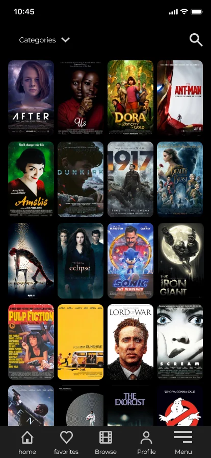
CyberFlix TV is a free movies and TV app for Android, used on phones and on Amazon Fire TV sticks. It is not distributed through the Play Store, so there is no listing doing the selling for it. The first screen is the whole storefront.
That is not a detail. It is the constraint the redesign was built around, and it is why this case ends up being about how much of a catalogue you can put in front of someone before they decide to stay.
02Overview
The app already existed. It had users, a catalogue, and a home page that was losing people. I was the only designer on it, working with a Project Leader and a Product Manager, and the brief was a redesign rather than a launch.
The work ran from the research on the wall to the screens that shipped, through an MVP, a round of user testing, and a release that changed its mind about the home page. Two months of work.
Outcomes
- Engagement went from 43% to 66%.
- Retention went from 40% to 65%.
- The average session went from 16 minutes to 25.
Measured by the team in the product’s own analytics, before the changes and after them.
Full process
The problem
The home page was overcrowded. Important features sat underneath less relevant content, so it was hard to focus on any single movie or series.
And the detail view was a dead end. Once you opened a movie, seeing a different one meant pressing go back. That is a small thing that happens dozens of times in a session, and it is the sentence this whole case turns on.
The opportunity
- How might we simplify the home page so people find and focus on what they want to watch?
- How might we let people browse from inside the detail view, without the back button?
- How might we make the size of the catalogue feel like an invitation instead of a wall?
The Team
- Project Leader: Manuel Aljibes Rosas
- Product Manager: Reinaldo Coronel
- Product Designer: Wagner Henriquez (myself)
03Discover
I started inside the app that already existed, and then in the ones people compared it to, looking for what the category had settled on and what it had only inherited.
Research came back as a wall of sticky notes. I grouped them by hand, and the six clusters are still readable in the photo: Where to watch, What to watch, Reviews and trailers, App issues, When to watch, and Watch with friends and family.
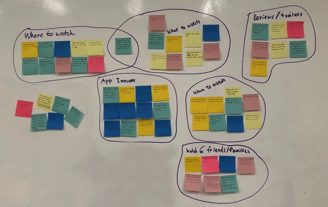
Two of those six are the product. Where to watch and What to watch are not features to build. They are the two questions somebody is holding when they pick up the phone, and the app answers the first one just by existing. Everything after this was about the second.
Key findings
- Features were hard to find. People did not discover what the app could already do.
- Searching for a specific title was frustrating, and it was the thing people tried first.
- Categories gave no sense of size. You could not tell whether a category held nine titles or nine hundred.
- Simple actions cost more than three taps.
- Nobody was attached to it. The app was useful and forgettable, which is a retention problem long before it is a design one.
04The decision
The app has no accounts. You open it and you are in. No sign up, no email, no password.
This approach to the user journey was a decision made by my Product Manager, to prioritise getting people to content immediately.
It was not my call, and I think it was the right one. It also cost more than it looks. No account means no watch history that follows you to a new phone, no recommendations that learn, and no list that survives a reinstall. Favourites had to live in the phone’s local memory. Every personalisation idea on that wall died with this one decision.
What it bought was the thing the app is actually good at: nothing standing between a person and the catalogue. I had already sketched a login screen. You can see it below, and you can watch somebody use it in the testing video. It never shipped.
05Ideation
I sketch on paper before anything else, annotate it, and take it to the team broken enough that people argue with it. The handwriting is mine and it comes out in two languages, which is how it actually happens.
The proposal was a single screen that reaches everything: movies, series, categories, personal lists, search, trending, recommendations and profile, without asking the user to work for it. From sketches into wireframes, on phone and on tablet.
06Design
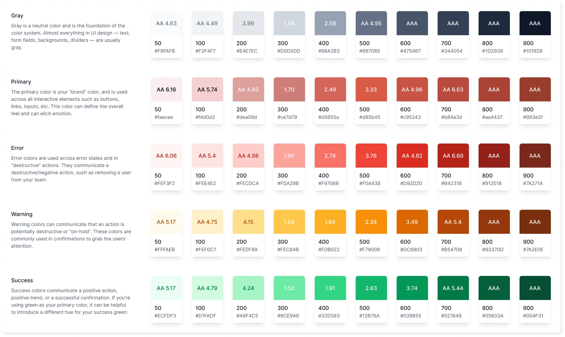
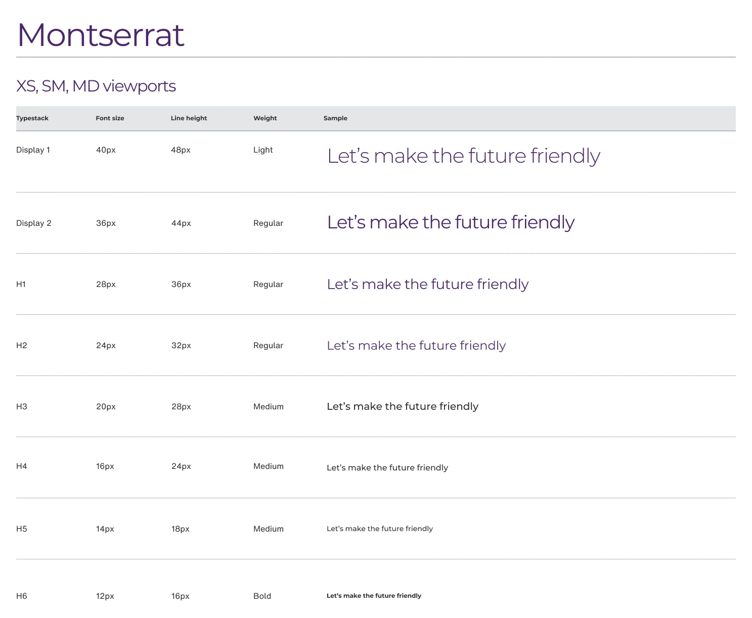
A dark app full of other people’s artwork has one hard job: get out of the way of the posters. The palette stays near black so the covers carry the colour, the type is one family at a few sizes, and the icons are a single weight. Contrast was checked against W3C guidance.
The MVP
The first build gave people the whole catalogue with a navigation that covered every interaction in the app: saving favourites, searching, browsing categories, and the profile settings.
Open the MVP prototype in Figma, the same one people used in the sessions below.
07Testing
We ran usability sessions on high fidelity prototypes with people who matched the audience, thinking out loud while they used it.
The sessions moved two things: the onboarding got simpler, and the navigation got flatter. Then leadership removed the onboarding altogether. Install the app, land on the home screen. That is the version that went out, and it is the same decision as the one above arriving a second time.
08MVP and release
Both of these are my screens. On the left the MVP, the first version we built and put in front of people. On the right the one that was approved after iterating on it: we looked at the data and at retention, and stripped the app down to what people came for. Here is what moved between the two.
The home page
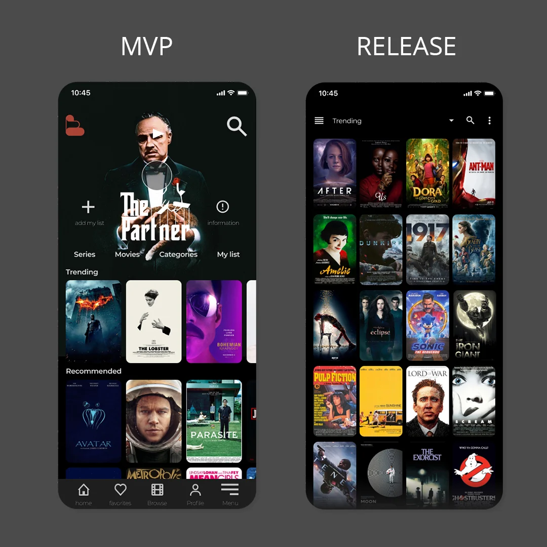
The MVP home was a streaming home page. One big hero, a row of shortcuts, then horizontal rows of Trending and Recommended. Count the first screen and you get the hero and about six posters.
The approved home is a grid. A list selector at the top, search beside it, and then twenty posters before you scroll. Same catalogue, three times the shelf, and any of them is two taps from playing.
What it cost. The hero is gone, and with it the only place the app could say watch this one. Faster to browse, weaker at recommending. For an app people open to look around rather than to be told what to do, that was the trade we took.
The detail view

The MVP already had related movies. They sat at the bottom, under the synopsis, the ratings, the director and the casting link: a strip three posters wide that you had to scroll to reach. So in practice, to see another movie, you pressed back. That is the friction in the problem statement, and the fix for it was already in the product.
The approved version promotes it. Two tabs under the poster, Overview and See also, and See also opens a grid twelve deep without leaving the movie you are on. Same content, different altitude.
The arithmetic is small and it is the point. Getting from one film to another used to be back, then scroll, then tap. Now it is tap the tab, tap the poster.
That is the whole answer to the problem this case opened with, and it is one tab.
09Project outcomes
I redesigned the home page and the detail view, and the numbers moved:
- Engagement 43% to 66%.
- Retention 40% to 65%.
- Average session 16 minutes to 25.
- Favourites and switching between movies stopped costing a trip backwards.
None of it shipped on a hunch. The changes went through usability sessions first and stayed under measurement afterwards, and the results came back in favour on every count. Browsing from inside a film instead of backing out of it is the behaviour those numbers are made of.
10What I learned
A home page is a bet about why somebody opened the app. The hero says we know what you want. The grid says you already do. Both are defensible. What you cannot do is hedge, which is what the MVP home was doing.
The fix was already in the build. Related movies existed from day one. Most of the work on this project was not inventing a feature, it was moving one up the page. I look for that first now, before I add anything.
Not every decision is yours, and the case is better when you say so. The no accounts call came from my Product Manager and it removed a whole category of design work. Writing down what a constraint costs is more useful than pretending you chose it.
Non disclosure agreements are normal in this kind of work, so parts of the process are not shown here. That applies across my portfolio.