01What is Cerebral?
Cerebral is an online mental health platform: therapy and medication management for anxiety, depression, insomnia, ADHD and PTSD, delivered by video and by phone on a subscription, with prescriptions sent to your door.
Nobody walks into a clinic. The whole service happens on a phone, which is what the film is selling and also what makes the tool behind it matter: if a clinician cannot find anything in your chart, the visit is the only place left to catch it.
02Overview
Behind every one of those visits sits an EMR, the electronic medical record where clinicians write down what happened. More than 500 clinicians in the network used it, and the time they spent fighting it was time Cerebral paid for.
Outcomes
- Clinician performance inside the EMR went up 20%, measured on the time it took them to write their notes.
- On a visit that was taking 70 to 75 minutes to close, that came out to 14 to 15 minutes back per clinician, on time the company was paying for.
- At the size of the network, that is money. More than 500 clinicians, most of them contractors paid by the hour.
On attribution: these are Cerebral's own before and after measures, and both of the changes behind them were mine: the chart redesign shown here, and a redesign of note taking that replaced free text with structured selections.
Full process
The Problem
A clinician described the patient chart like this, in a research interview:
"It's like going on a scavenger hunt for the right information, you have to keep expanding and scrolling down to the very bottom to find what you need."
Cerebral clinician, user interview.
That sentence is the whole project. Three things followed from it:
- Documentation was taking about 70 minutes per appointment. Clinicians are paid by the hour, so every minute of overflow was on the company bill, and it pushed the next session back.
- Patients could feel it. Feedback kept saying the same thing: the clinician was always typing, and it read as not being listened to. In mental health care that is not a cosmetic problem.
- The chart itself was the bottleneck. The information existed. It was just buried, so preparing for a visit meant hunting for it first.
My Role
I was the Product Designer on the patient chart, working with the Lead Designer and three product managers who each owned a different part of the EMR. I ran the research, synthesised it, and owned the patient summary and the chart navigation through to handoff. The project ran about four months.
The Team
- Product Manager: Yara Mukaled
- Product Manager: Monica Cabaj
- Product Manager: Zoe Snow
- Operations Manager: Conor Hill
- Lead Designer: Anckia Treurnicht
- Product Designer: Wagner Henriquez (myself)
03Discover
What the research actually said
I started from a hypothesis instead of a backlog: that a summary of what clinicians check every visit, plus fixing where those things live, would cut preparation time.
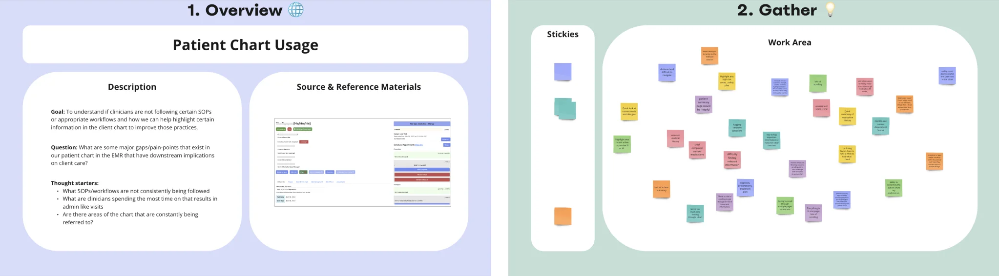
Eleven clinicians, three ways. Interviews of thirty minutes with six therapists and five prescribers. Shadow sessions with two therapists and three prescribers, watching them prepare for and run a visit instead of describing it. And a workshop with Cerebral's Clinical Advisory Board on what belongs in front of a clinician before a visit starts.
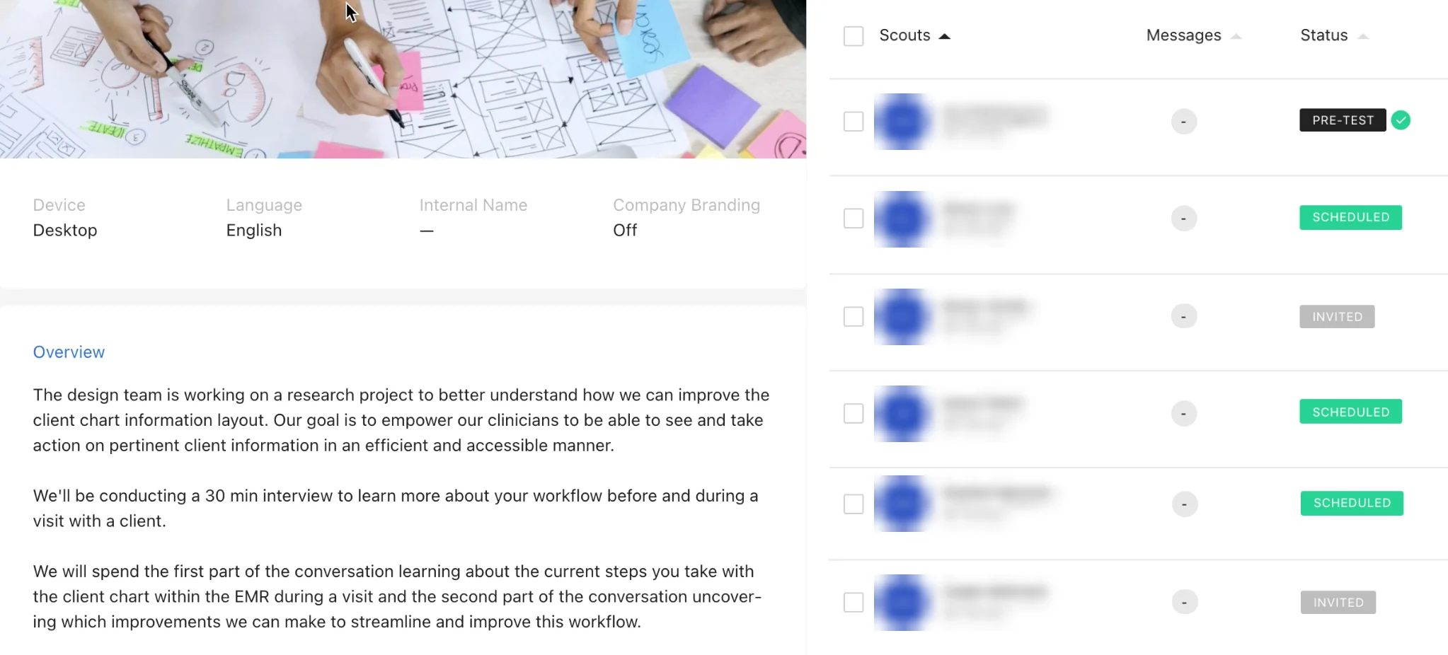
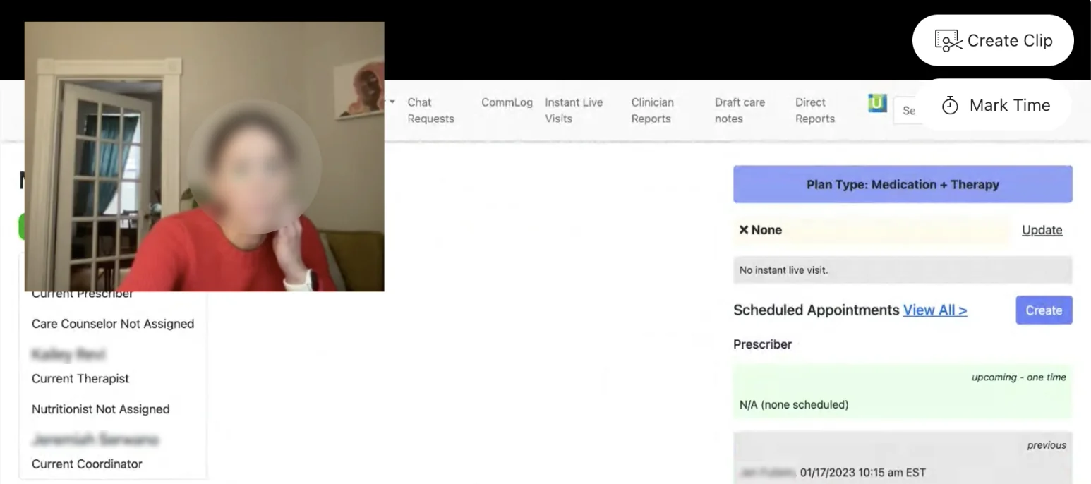
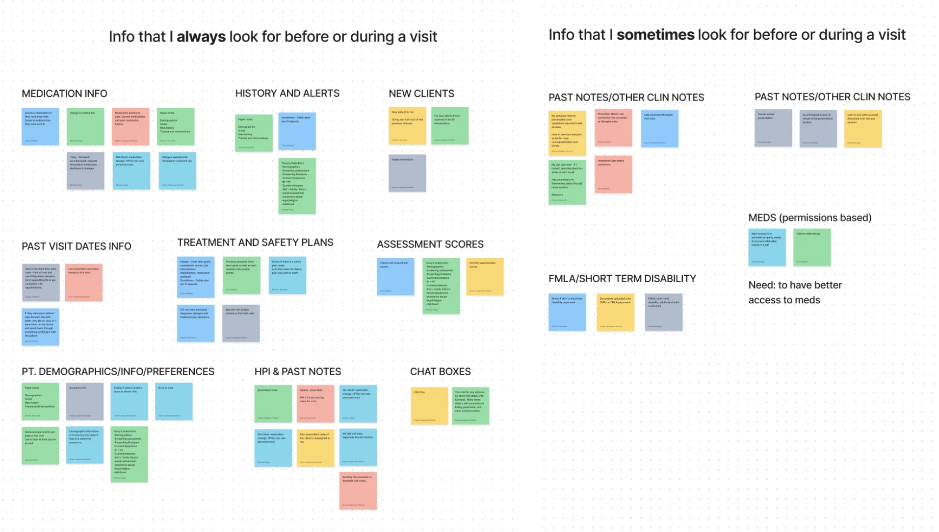
Then I tagged all of it. Every note went into Dscout and a Miro board, tagged and clustered into a heat map, so the brief came out of counts instead of whoever spoke last.
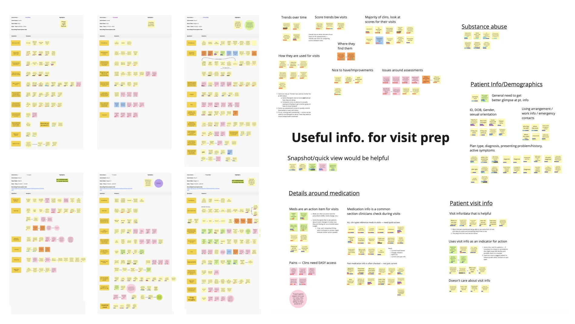
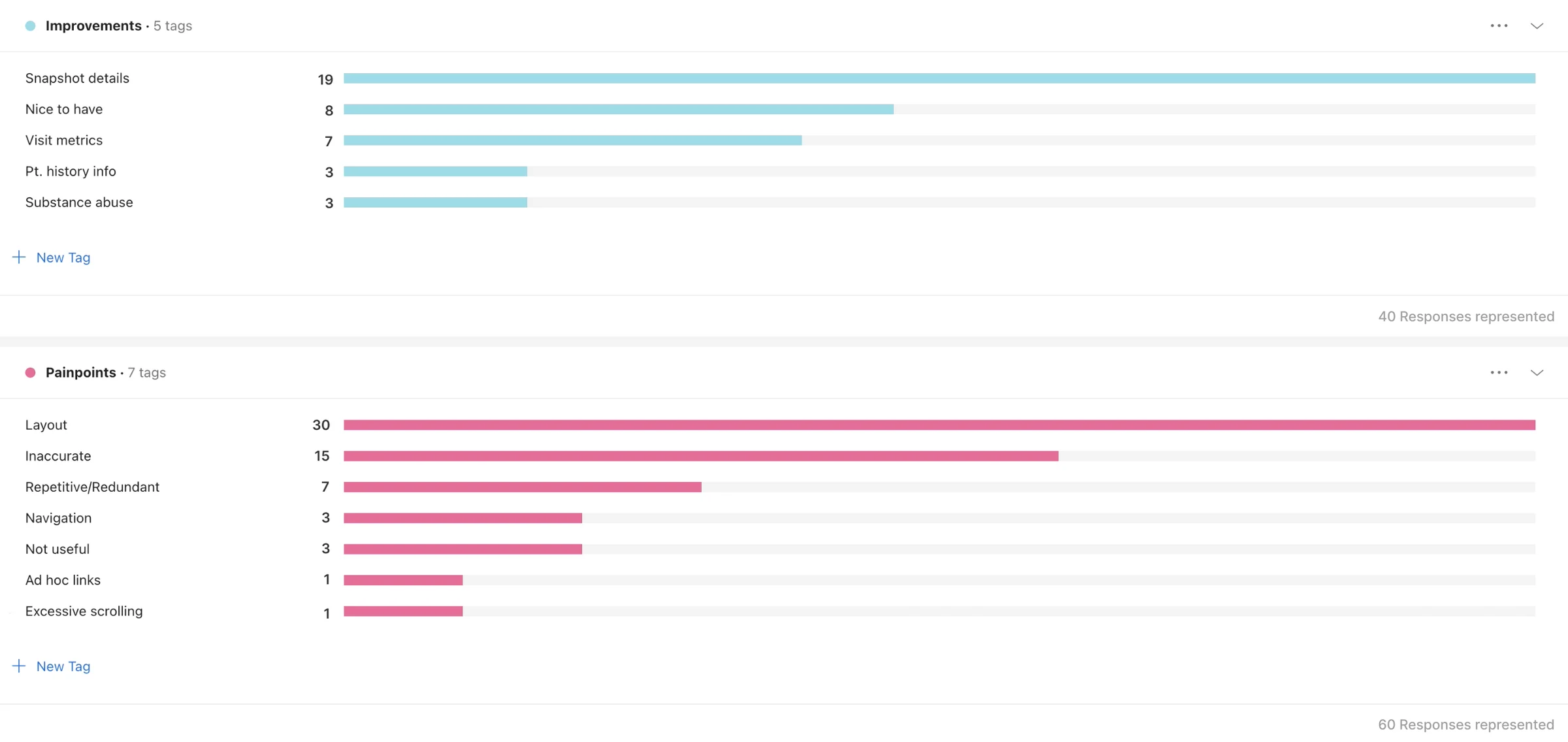
The counts were not ambiguous:
- Layout was half of every complaint. 30 of 60 tagged pain points, ahead of inaccurate information (15) and repetitive or redundant content (7).
- A snapshot was the top request. 19 of 40 tagged improvement requests asked for the same thing: the key details of a patient on one screen. The next one down had 8.
"If you’re gonna require me to put it in notes, then why aren’t you letting me have access to it."
A second clinician, on the same board. The information was not missing. It was just somewhere else.
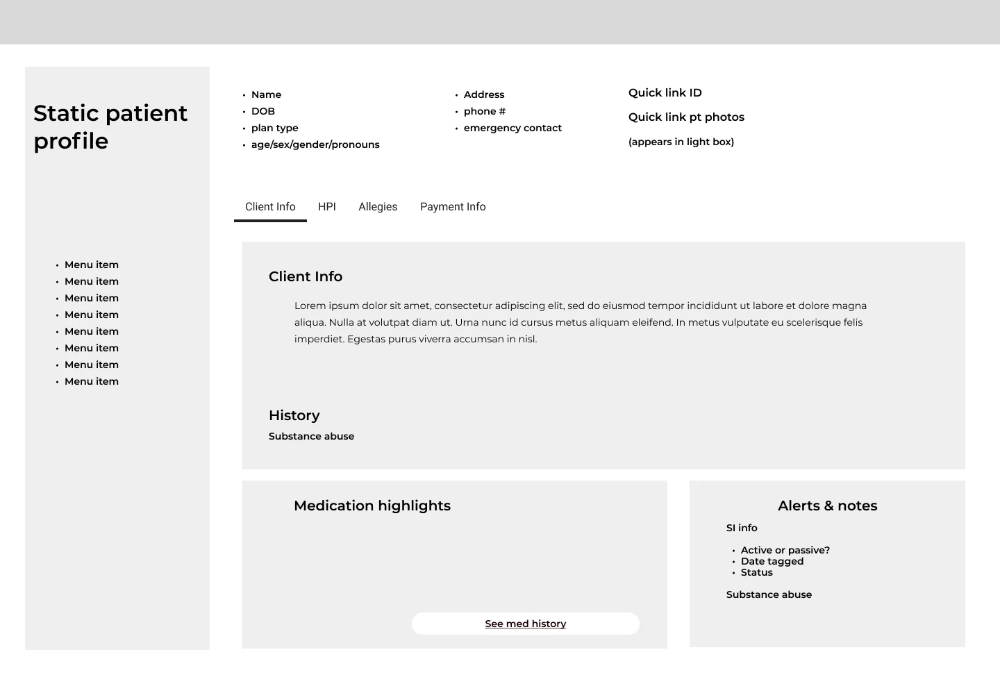
And one finding sat outside the counts. There was no reliable way to see that a patient had been flagged for an event of high acuity. That is not a time problem, it is a safety one, which is why the summary I wireframed carries a dedicated alerts block: whether suicidal ideation is active or passive, the date it was tagged, its current status, and substance abuse history. Everything else in this project was about saving minutes. That block was not.
Those two numbers are the entire brief. What clinicians complained about most was the layout, and what they asked for most was a summary. So the project became two things and nothing else: build the patient summary, and rebuild the chart's information architecture around it.
04The decision
Tabs or a sidebar
The chart already had a tab structure, and the safe move was to drop the summary into it. Tabs were what clinicians already knew, they were already built, and engineering could ship them faster.
I took two options to the clinical stakeholders and tested both: the summary inside the existing tabs, and a left sidebar that put the information they check most one click from anywhere in the chart.
What came back was bigger than a winner. Those sessions are where the order of the new chart came from: what earns a place in the sidebar, what a clinician checks on every single visit, and what they only open when something looks wrong. Everything in the interface further down this page was arranged out of that conversation, not drawn first and shown to them afterwards.
The sidebar won, and I argued for it. Tabs would have fixed one page. The complaint was never one page: it was that finding anything meant expanding sections and scrolling to the bottom. A persistent sidebar changes what the chart is. What you check every visit stops being somewhere you navigate to and becomes something that is simply there.
What it cost: horizontal space on every screen of the chart, and noticeably more engineering than the tab version. I took that trade because 30 of 60 complaints were about layout, and the tab option was never going to move that number.
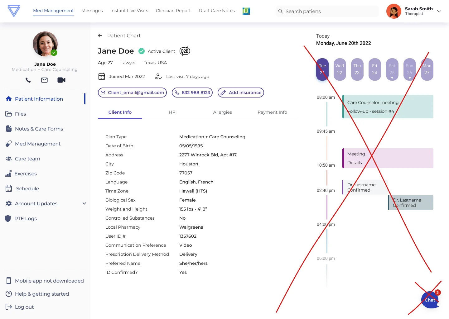
What the chart was actually holding. Ten sections at the top level, and they were not all for clinicians. Next to notes, medications and appointments sat the billing log, the payment profile ID, the Chargebee subscription ID and a button to convert the account to B2B. A clinician preparing for a visit needs about five things. The chart was built to hold everything the company knows about a patient, and it drew no distinction between the two.
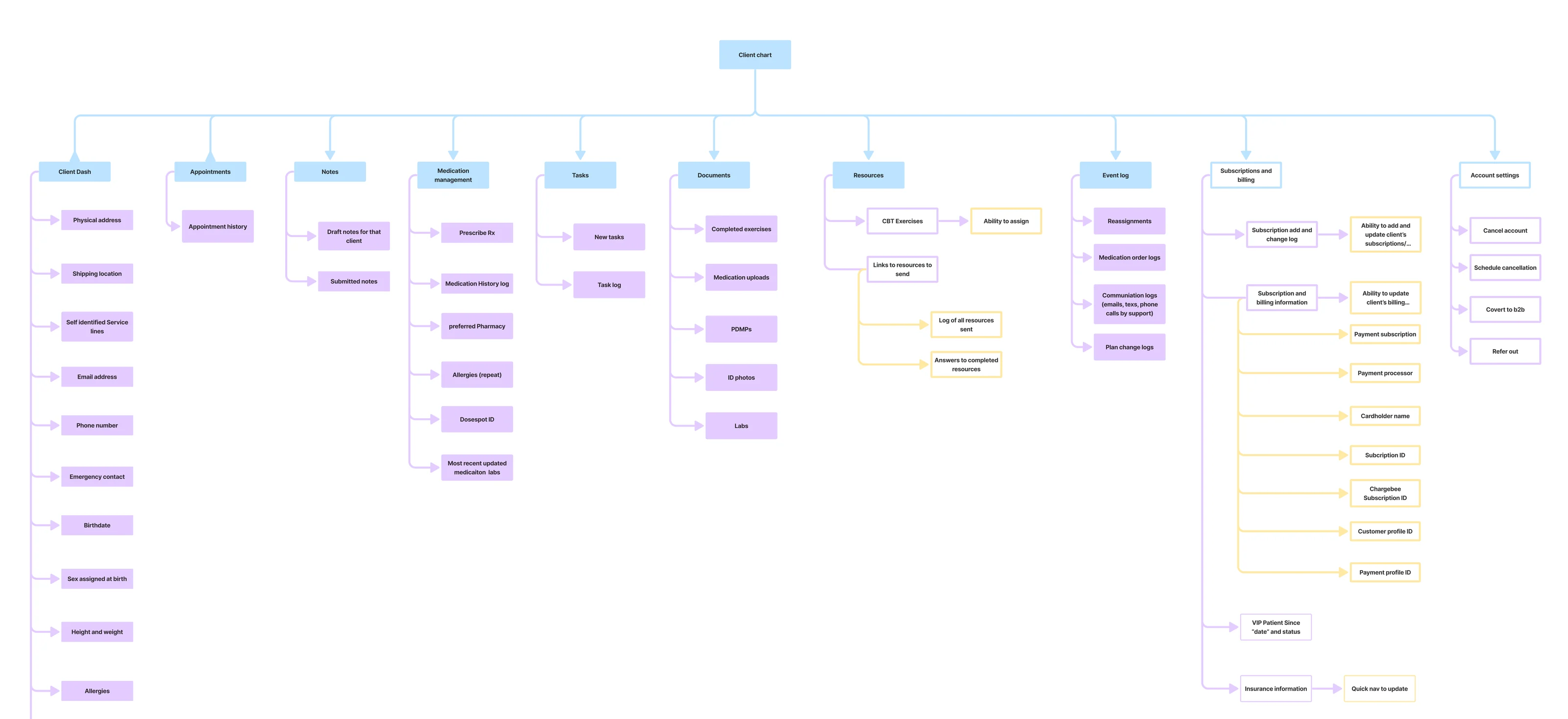
05Before
What clinicians used for three years
06Design
The patient summary
Everything a clinician checks before a visit, on one screen, in the order they check it: who the patient is and how to reach them, the last visit note, the treatment plan, the appointment history, and the assessment scores.
The scores are the part I would defend hardest. A number on its own, Anxiety 12, tells a clinician almost nothing at a glance. The same number carrying its change since the last assessment, down 3 points, is a conversation opener. That is the difference between a summary that saves a click and a summary that saves the first five minutes of the visit.
Side by side, the change is not cosmetic. The old chart opened on staff administration: five reassignment rows and nine coloured action buttons, from Sync Chargebee to View RTE Logs, none of which a clinician needs before a visit. The new one opens on the patient: who they are, what happened at the last visit, what the plan is, and where the scores are heading. And the navigation that used to be a row of tabs across the top became a sidebar that stays put.
07Project outcomes
Fifteen minutes a clinician
Clinician performance inside the EMR went up 20%, measured on the time it took to write a note. On a visit that was taking 70 to 75 minutes to close, that came out to 14 to 15 minutes back.
Fifteen minutes does not sound like a redesign. It is a fifth of the time a clinician spent writing instead of treating, and that time was paid. Which is why this was a business problem and not a complaint: a chart nobody can read does not cost a bad review, it costs the time the company pays for after the appointment.
And at the size of that network it stops being a usability number. More than 500 clinicians, most of them contractors paid by the hour. Fifteen minutes each, on every visit, is not a nicer interface. It is payroll.
On attribution: these are Cerebral’s own before and after measures, and both of the changes behind them were mine: the chart redesign shown in this case, and a redesign of note taking that replaced free text with structured selections.
08What I learned
Three things I took from this
- Counting the complaints beat arguing about them. "Clinicians find the chart hard to use" is an opinion, and anyone can push back on an opinion. "30 of 60 tagged pain points are about layout" ended the debate about what to build first.
- The safe option is not always the cheap one. Keeping the tabs would have shipped sooner and left the actual complaint untouched. Arguing for the more expensive build was the job, not a preference.
- Partial approval is the normal outcome, and it is worth showing. Most of the work in a large clinical organisation is deciding what to keep when you do not get everything.
Parts of this project are covered by an NDA, so some of the process and some screens are not shown here. That applies across my portfolio.