01What is Pebblebee?
Pebblebee makes rechargeable Bluetooth trackers that help people find what they lose most: keys, wallets, luggage, bikes, pets and the phone itself. The range runs from the Clip, the Card and the Tag to trackers built into the object, like the Loc8 in the video, which lives inside a bike handlebar.
Every one of them has to work on both Apple Find My and Google Find Hub, two finding networks with different rules, on iOS and Android at once. That constraint sits underneath a lot of what follows.
02Overview
The app is where all of it happens: it is how you claim a device, set it up, name it, make it ring, and share it with the people you trust. If the app is confusing, the hardware in your pocket feels broken.
Outcomes
- Google Play rating went from 2.4 to 4.7 on the same listing, and from 68 reviews to 981.
- Returning users got denser, not just more numerous: for every 100 new users, returning users went from 64 to 94.
- Downloads went from 10K+ to 100K+ over the same period.
Full process
The Problem
- Almost half of new users never finished setting up their device. Only 54.31% of first app opens reached setupCompleted. The single biggest leak was scanning the device: 28% of the people who had just logged in never got a device scanned. Every one of those users had already paid for hardware sitting on their desk.
- The app worked, until it didn't. The home screen was functional, but everything past it was hard to follow. When something failed, the app said so like this: "Error! There was an error searching for your devices. Turn off and on your phone's bluetooth and try again. If the issue is still present restart your phone." That is the app asking the user to debug it.
- The store rating was the receipt. 2.4 stars, with more reviews at one star than at five. One review from April 2025: "none of the devices I bought would connect to the app at all… I feel a bit swindled that I bought all these trackers and they're all dead in the water." For a hardware company, the app rating is the product review, and it was the number the business needed to move.
The Opportunity
- How might we get more people through device setup without adding a single step to the flow?
- How might we make the home screen answer one question instead of offering ten?
- How might we make failure states tell the user what to do next, instead of asking them to restart their phone?
- How might we raise a public rating of 2.4 stars, a number we do not control directly and can only earn?
My Role
I was the Product Designer on the app redesign, from discovery through delivery and into the improvements that followed. Design started in June 2025. I handed off V.1 in the middle of September 2025 and it shipped shortly after. Since then we have been releasing smaller improvements and features on top of it, so the numbers below cover roughly a year of the new app in the wild.
The Team
- Product Manager: Nicolas Gutraich
- Strategic Advisor & Manager: Tom Frazier
- Product Designer: Wagner Henriquez (myself)
03Discover
Research approach: benchmarking 100+ apps
As part of the discovery and research phase, and instead of starting from our own backlog, I ran a structured benchmark of more than 100 apps. This was not a screenshot hunt: I went through each one the way a user would, and scored them on the things our own funnel was failing at. How many steps stand between opening the app and doing what you came for. What the app does when a connection fails. How much the home screen tries to say at once.
And deliberately not only our competitors. Item finders and apps that pair with a device were part of it, but most of what I went through were apps from any category at all: banking, delivery, streaming, utilities. People do not learn what to expect from an app by using our competitors. They learn it from everything else already on their phone, and that is the standard we were actually being measured against.
What the benchmark actually told me: nobody wants an app. They want their keys. Across categories, the apps people rated well were the ones with the shortest possible distance between opening the app and doing the one thing you came to do. The ones people rated badly were the ones that tried to be a platform.
The other inputs: user testing, product analytics, and all 68 reviews
Four customers volunteered to be part of the process, and we kept going back to them. We would test the flows we were changing, take what they said, iterate internally, and show them again. Four people is a small number and I am not going to dress it up as a study. What it was good for is the thing small samples are actually good for: catching what confuses someone the first time they see a screen, which is exactly the moment our funnel was losing people.
Then I spent as much time in Mixpanel and Firebase as in Figma. Not the funnel totals, the behaviour underneath them: where people spent their time in the app, what they tapped most, and what they never tapped at all. That last one settled arguments. It is hard to defend keeping something on the home screen when the data says almost nobody has ever touched it.
Between the two we could check a decision from more than one angle before committing to it: Mixpanel for how people moved through a flow, Firebase for how the app actually behaved in their hands, across devices and versions. Most of the calls in this project were validated with data before they were drawn, not defended with data afterwards.
The third input did not need recruiting. The old app had 68 public reviews and an average of 2.4 stars, and I read every one of them. The reviews at one star kept saying the same three things: the device would not connect, the app told them to restart their phone, and they could not tell whether setup had actually worked.
One of them, from April 2025, is the reason this project existed: "none of the devices I bought would connect to the app at all… there’s absolutely no support on their website for this issue, so I feel a bit swindled that I bought all these trackers and they’re all dead in the water."
Store reviews are a biased sample and I treated them as one. People write when they are angry, and nobody reviews an app that simply worked. But they were the only feedback our users had given us unprompted, they cost nothing to collect, and they pointed at exactly the same step the analytics did: getting the device connected. When the qualitative and the quantitative agree, you stop looking for a third opinion and start designing.
04The decision
Less is more, and what I argued against
Before discovery, the internal conversation was heading somewhere else: a richer home screen with more features, more options and more entry points. It is the natural instinct when a product is growing, and it had support.
I argued against it, and the benchmark is what let me argue. If the apps rated best in the category win by getting out of the way, then adding surface area to the home screen would move us in the wrong direction. Our problem was not that users wanted more; it was that 28% of them never got a device scanned.
So the home screen answers one question and nothing else: this is your item, and if you don't have one yet, this is where you add it. Everything else moved one level down, into the item itself.
What I gave up: discoverability for the secondary features. Anything that is not "your items" now costs one extra tap, and the home screen no longer advertises what the app can do. I took that trade because the setup funnel was where we were losing money, not the feature list.
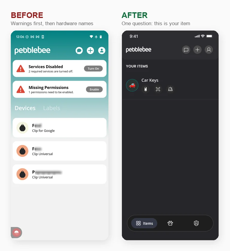
The old home named your things after the hardware you bought: Keys Tag · Tag Universal. The new one names them after what they are: Car Keys, with the three things you actually came to do sitting under the name. And when something needed attention, the old home pushed your items further down to make room for red banners about permissions and services, so the first thing you saw was a chore.
05Ideation
Ten versions of one screen
The home screen took the longest, because it was the one carrying the decision. Ten versions, in order, until it stopped trying to do too much.
The versions that lost are the interesting ones: each of them was a slightly different answer to "what else should the home screen do?" The one that shipped is the one that stopped asking.
06Before
The app we were replacing
The old app, and the onboarding a user went through to claim a device before the redesign.
07Design
New UI, new experience
From the first launch to a claimed, named, working device. No mockups and no prototype: this is the shipped build, recorded on a phone: press the device five times, the app finds it, links it to Apple Find My, and lands on “You’re All Set”.
08Project outcomes
The rating
This is the outcome I care most about, because it is the one I cannot spin: the Google Play listing is public and anyone can open it.
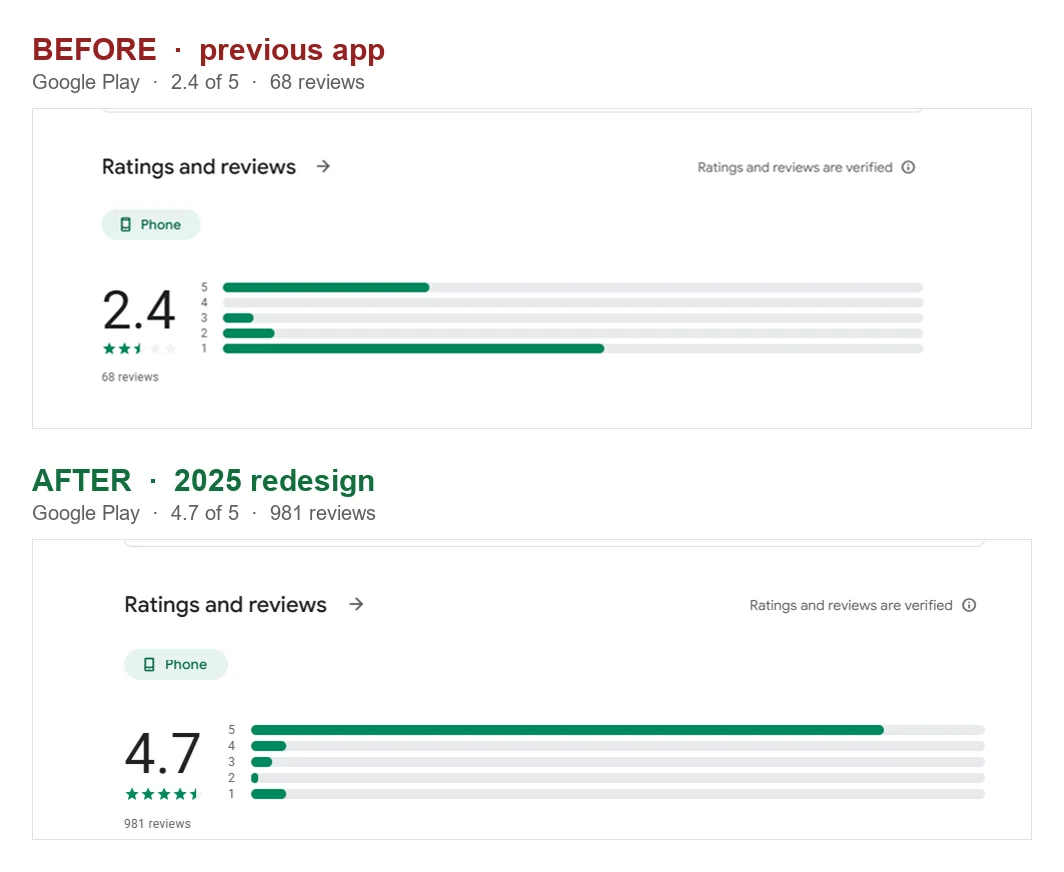
2.4 → 4.7 on the same listing, and the shape of the distribution flipped: the tallest bar used to be one star, now it is five. Reviews went from 68 to 981 and downloads from 10K+ to 100K+ over the same period.
Being honest about attribution: a store rating is never one team's doing. Firmware, hardware and support all improved alongside the app, and more people bought devices. What I can say precisely is that the redesign shipped in late 2025 and the rating climbed over the year that followed.
Retention
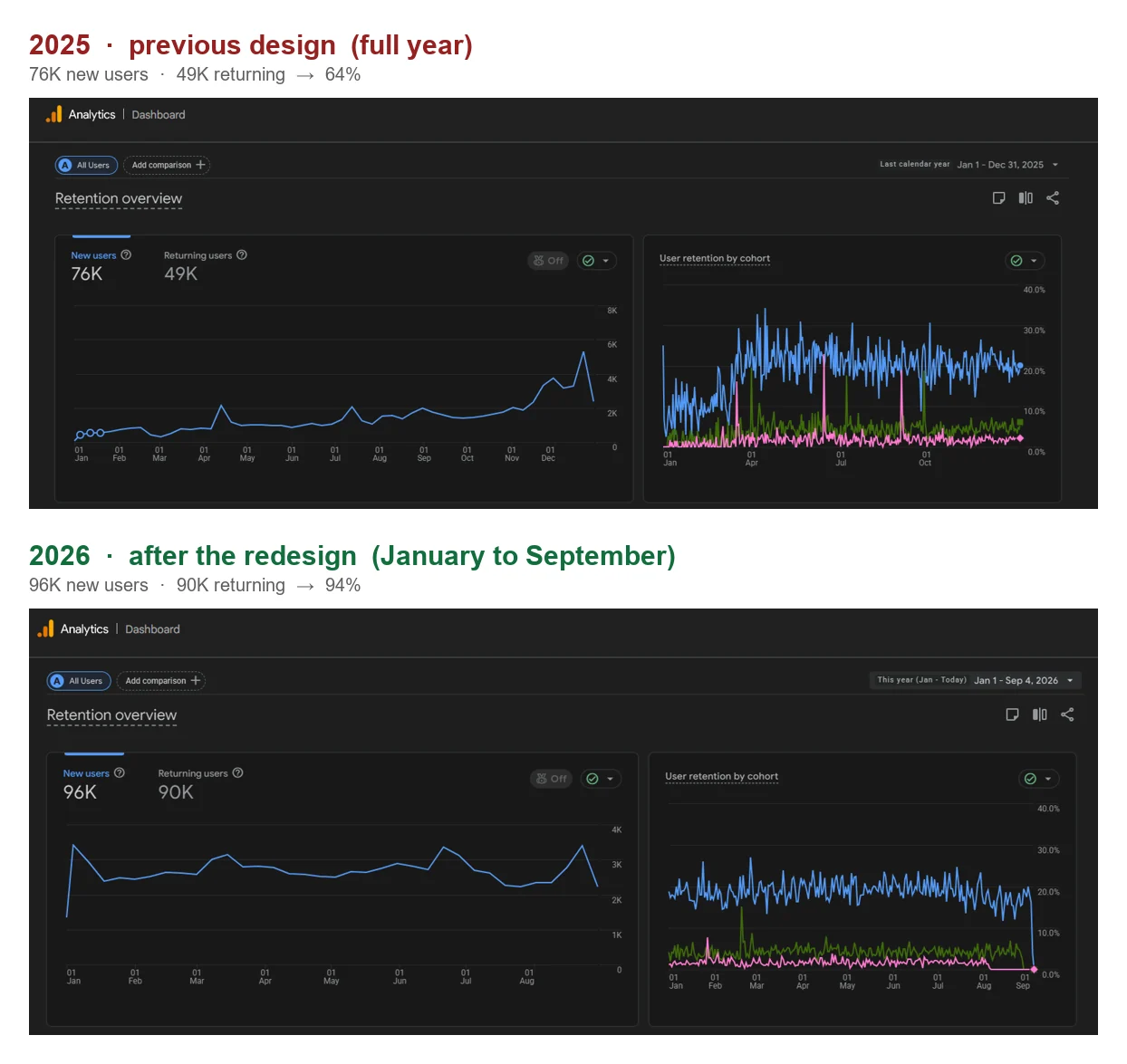
On the old design, across the whole of 2025, the ratio of returning to new users was 64%. Eight months into 2026, on the new one, it is 94%. And there are already more returning users in those eight months than in the whole previous year.
09The wider system
The redesign did not stop at the app
A tracker is not only an app. Once the app changed, three surfaces around it changed with it, and each one came with its own design problem.
Invitations go out by SMS, either from your contacts or typed by hand.
Note the line at the top: you can pair with either network, but only one at a time.
The fields are written for a vet as much as for a neighbour: microchip number, weight, medication.
None of the three existed as a screen when the redesign was drawn: one hands a stranger a browser instead of an app, one runs before the app is installed, and one is a kind of item the model had to learn to hold. A redesign is worth what it can absorb afterwards.
10Beyond the redesign
Precision finding, without faking the precision
The redesign was the foundation. What came after it are the features built on top, and Channel Sounding is the one I am most proud of, because it is the hardest kind of interface to design honestly.
Channel Sounding uses Bluetooth to estimate how far away your item is by measuring the signal between it and your phone. The catch: that reading is noisy. It drifts, it jumps, and it only firms up as you get closer. A screen that showed a confident number would be lying to the user roughly half of the time.
So the screen never claims precision it does not have. The distance is written in deliberately loose language that tracks how much the signal can actually be trusted: More than 20 feet, then Roughly 15, then Less than 5. And instead of a map, each stage tells you what to do next: keep walking → keep going, the area keeps narrowing → it is somewhere close, slow down → stop walking and look around you.
The whole screen carries the same signal: a ring of scattered dots tightens as the estimate sharpens, and the background lifts from almost black to bright green. You feel you are getting closer before you have read a single word, which matters, because you are walking around a room holding your phone, not reading. The interactive prototype below walks through the whole thing.
11What I learned
Three things I took from this
- A benchmark is an argument, not a slide. The 100 apps were not research theatre. They were the only reason I could push back on "more features on the home screen" without it being my taste against someone else's.
- Fix the step people are standing on. It was tempting to redesign everything at once. The funnel said the money was leaking at device scanning, and that is where the work had to land first.
- The rating is a lagging indicator, and that is fine. It moved months after we shipped. Designing for a number you cannot touch directly means shipping the thing you believe in and being patient enough to let it show up.
12Also built
The side of the app only the team sees
This is not a case study about a project that ended. V.1 shipped in September 2025 and we have not stopped since. Safety Circle and its portal, Pets and Channel Sounding did not exist the day the redesign shipped.
When a customer writes to support, somebody has to see their whole account at once. So I also designed the internal dashboard behind the app. You search for a person and land on one page with every device, link and pet on their account. From the top of that page the team can send a login code or unlock an Alert profile, and any device can be moved to another account from its own panel.
Each tab answers one question: who is in their Safety Circle, which phone and app version they were on, what they pay for, and what happened with each alert. Phone numbers stay masked until someone chooses to see them, and every employee gets permissions per area, so reading an account and deleting a device are separate rights.
The app is public: it is on Google Play and the App Store, and the ratings and reviews quoted are visible on the store listing. The dashboard is internal, and its screens use placeholder data.