01What is Aucto?
Aucto is a marketplace for used industrial equipment. Lathes, excavators, transformers, whole plants when a factory closes. Buyers and sellers meet on the public site, but the money, the paperwork and the trucks are handled somewhere else: ARS, the operations platform the staff live in all day.
This case is about one screen inside it. The Sales Order. It is the object an operations person opens when a lot sells and closes when the equipment leaves the yard, and on a busy day they open dozens of them.
02Overview
Here is the fact the whole project turns on. ARS generates the invoice by itself when an auction closes, but nobody lets it finish the job. Every asset is added and checked by hand, one at a time, because a single item can run past a hundred thousand dollars and the money can arrive by card, by one wire, or by several spread over weeks. Too much rides on each line to let it post itself.
So the Sales Order is not a document somebody reads. It is a workbench somebody works at, dozens of times a day. Everything below is about how long a turn at that bench takes.
Outcomes
- A Sales Order that took 6 to 12 minutes now takes 3 to 6. Roughly half, depending on how many assets it carries.
- The ratio holds at the small end too: the simplest orders went from 4 minutes to 2.
- A full auction is comfortably more than 36 orders, so a single auction gives back somewhere between 2 hours and half a day.
Averages, timed by the operations team on real orders. There is no public dashboard behind an internal tool, so this is their measurement.
Full process
The problem
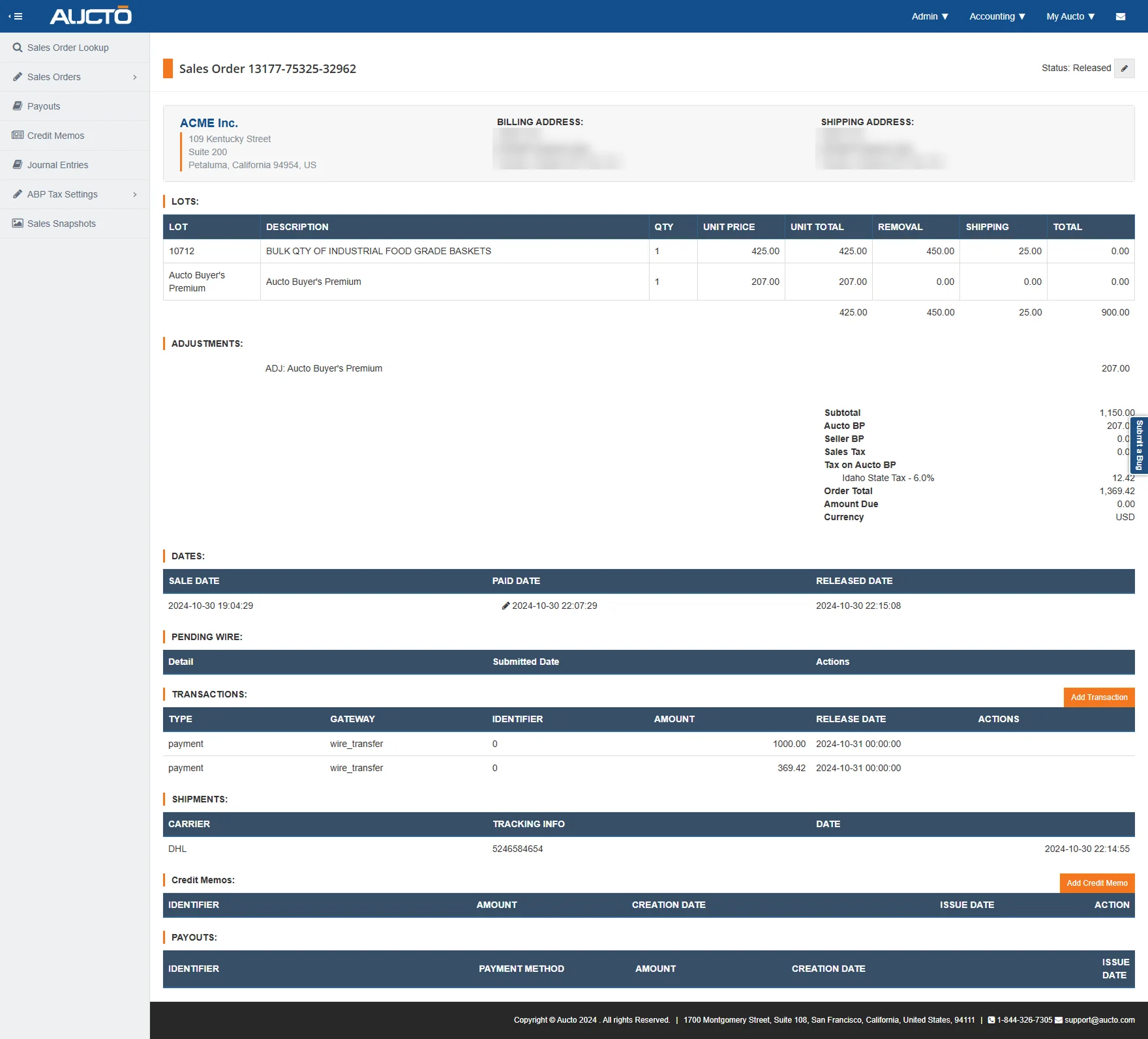
The old screen taxed the one thing this work runs on: attention. Eight tables stacked, all the same navy header, the same weight and the same size, in the order they happened to be built: lots, adjustments, dates, pending wire, transactions, shipments, credit memos, payouts. Nothing on the page is louder than anything else, so the reader has to be.
And the numbers got lost inside the interface. The figures somebody is actually working with, the order total and the amount still owed, sit in a plain stack floating to the right of the lots, in the same type as the labels around them. Nothing is heavier, nothing is nearer, nothing is marked. So you read it twice to be sure. Twice, on every order, dozens of times a day.
Adding an asset was the slowest thing on the page, and adding assets is the job. Between the interface and the infrastructure underneath it, the step people repeat most was the step that cost most.
Part of that flow did not even live in ARS. It ran on separate legacy infrastructure, so finishing one order meant working across two systems and carrying figures between them by hand.
The opportunity
- How might we make the numbers people work with readable in one look instead of two?
- How might we make adding and correcting an asset the fastest thing on the page, since it is the thing they do most?
- How might we bring the whole flow inside ARS, so nobody has to leave to finish a job?
- How might we do all of it without taking away a single field, when we do not know which one somebody depends on?
My Role
I was the product designer on both halves of Aucto: the public marketplace where the equipment is listed, and ARS, the platform where the sale is actually carried out. This case is the second half, and inside it, one screen.
The Team
- COO & Head of Product: Lucas Flosi
- Director of Engineering: Andy Lai
- Senior Full Stack Developer: Ernest Villa
- Senior Full Stack Developer: Leo Xia
- Product Designer: Wagner Henriquez (myself)
03Discover
The problems were found by watching the platform being used. No survey and no workshop: the people who run the process shared their screen, walked the Sales Order the way they walk it every day, and I asked questions. The sessions were recorded.
The manual part is deliberate, and it is most of the work. Card payments settle themselves. Anything above the card limit has to go by wire, and a wire is a person: “every morning what finance will do is check all the payments”, and then “we will go into the system and manually mark the invoice as paid”. Nobody was asking me to automate that away. They were asking for it to stop being slow.
The screen had grown one tab at a time, and they said so while showing it to me. On the newest one: “we recently added an additional tab called lot staging”, so that when a lot does not sell and the buyer and seller agree a price afterwards, the asset can be added to an invoice that already exists, “instead of having separate invoices”. Every tab on that screen had once been somebody’s good reason.
One of them was already dead, and I was told to skip it. “Ignore custom item”, the walkthrough said. “This is a tab that was designed when we had auctioneers on the marketplace. It’s kind of a dead tab now.” It was still sitting in the same row, at the same weight, as the tab where the money is.
And on one step, nobody in the call could say whether it was still real. We reached shipping. “We don’t really do this anymore, right? This is dead.” “No, this is still active as far as I know.” Then “that’s a question for operations”, then “I could be wrong”, then “I could be wrong too”. The walkthrough ended on “you might need to speak to operations, because there sounds like there’s some things in here that I don’t know about, which is shipping, for example”.
Two people who work with this tool every week, unable to agree on whether a field on it still means anything. That is the whole argument for what I did next.
And the ask came from them, not from me. Halfway through, the person driving stopped and said: “moral of the story is I think most of those tabs can go away”. What I said back is the redesign in one line: “what I have in mind is like having everything in the same screen”.
Key findings
- The invoice is generated automatically and finished manually. That gap is the project. The design cannot remove the manual work, so it has to make it cheap.
- The order is a sequence, not a document. People think in stages: get it paid, get it collected, close it. The old page presented it as one long record.
- Reading was costing as much as doing. Checking a figure meant hunting for it first, and that happens on every pass.
- Everything on the page is somebody’s favourite field. A field that looks like clutter to a designer is the one thing an accountant checks every time.
04The decision
Nothing here needed to be invented. It needed to be reordered. The sessions, and the meetings with the people who use the platform that followed them, said plainly what the job was and in what order it happens. So the page was rebuilt around the job instead of around the database.
The tempting move was to cut fields. I did not cut any. On an internal tool every field on screen is load bearing for somebody, and that somebody is usually not in the room. Deleting one is a bet that nobody needed it, and you find out you were wrong at month end.
So instead of removing information, the redesign changes what the page is: from a record of everything that has happened, to a view of where the order is now.
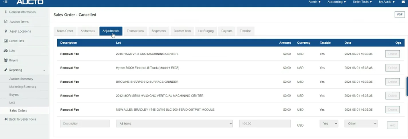
Nine flat tabs become three stages. The old Sales Order was already divided up: Sales Order, Addresses, Adjustments, Transactions, Shipments, Custom Item, Lot Staging, Payouts, Timeline. Nine peers, in no particular order, none of them telling you which one you need.
The new one has three: Order Info, Fulfillment, History. Not nine drawers but a sequence, with a tick on what is done and a count on what is waiting. Nothing was deleted. The nine drawers are still in there, sorted into the stage they belong to.
05Before and after
The same order, in both. Same reference, same assets, same money. This is not an old screen next to a nice new one from a different job.
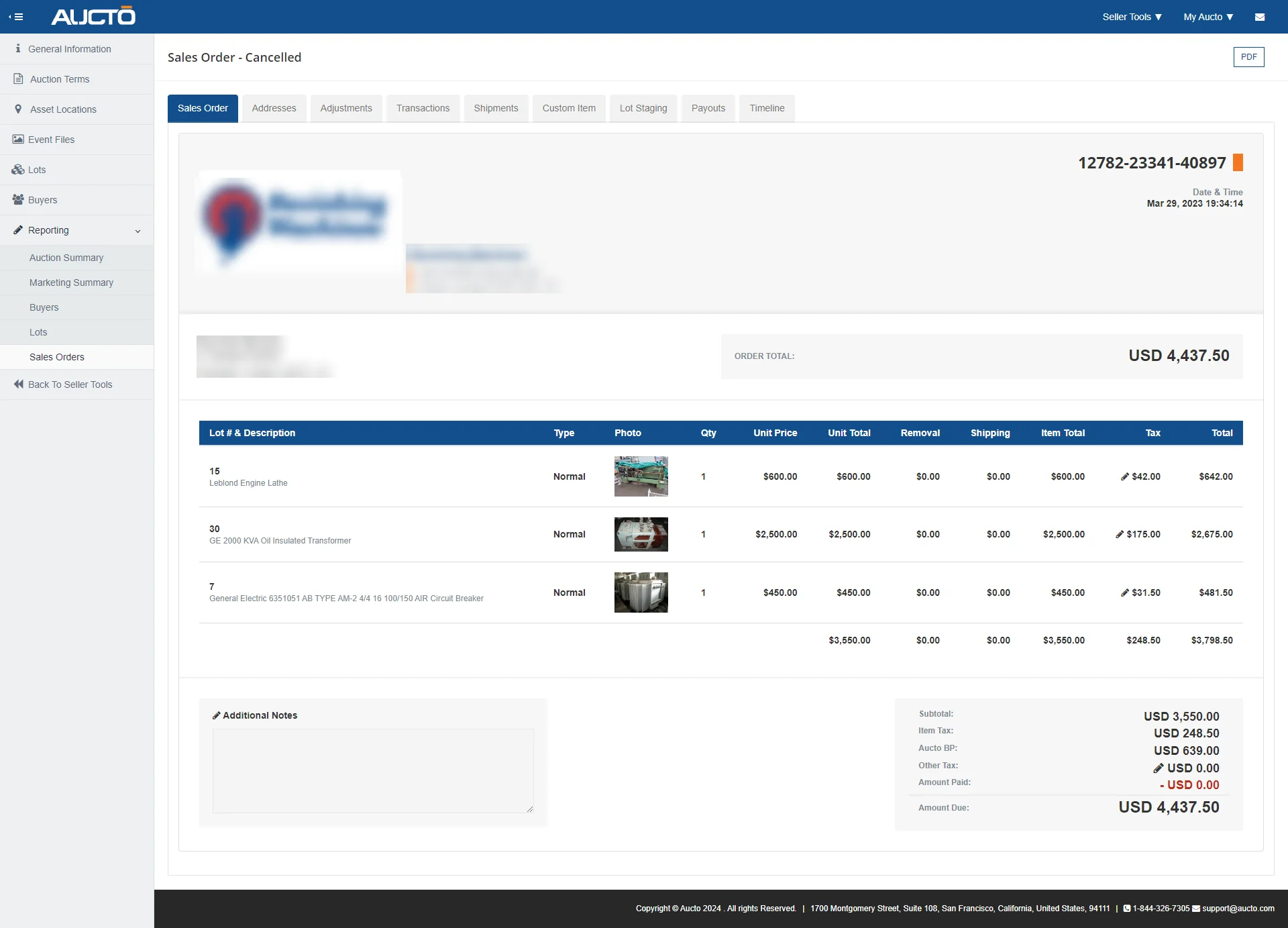
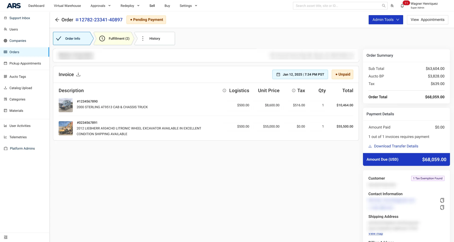
What changed, in order of how much it matters:
- The order has a state now. A stage tracker at the top, and a status chip next to the number. Before, you worked out where the order stood by reading it.
- One amount is louder than the rest. Amount Due gets a dark block. Every other figure keeps its place, quieter.
- The line items carry a photograph. These are physical machines. A thumbnail turns a part number into a thing somebody has to put on a truck.
- The people and the addresses moved into one column instead of three header blocks, so the left side is the order and the right side is who and where.
And one level up
The order page is where the work happens, but the list is where the day starts. It had the same problem, larger: fifteen columns, every order at the same weight, and no way to see what the business was waiting on.
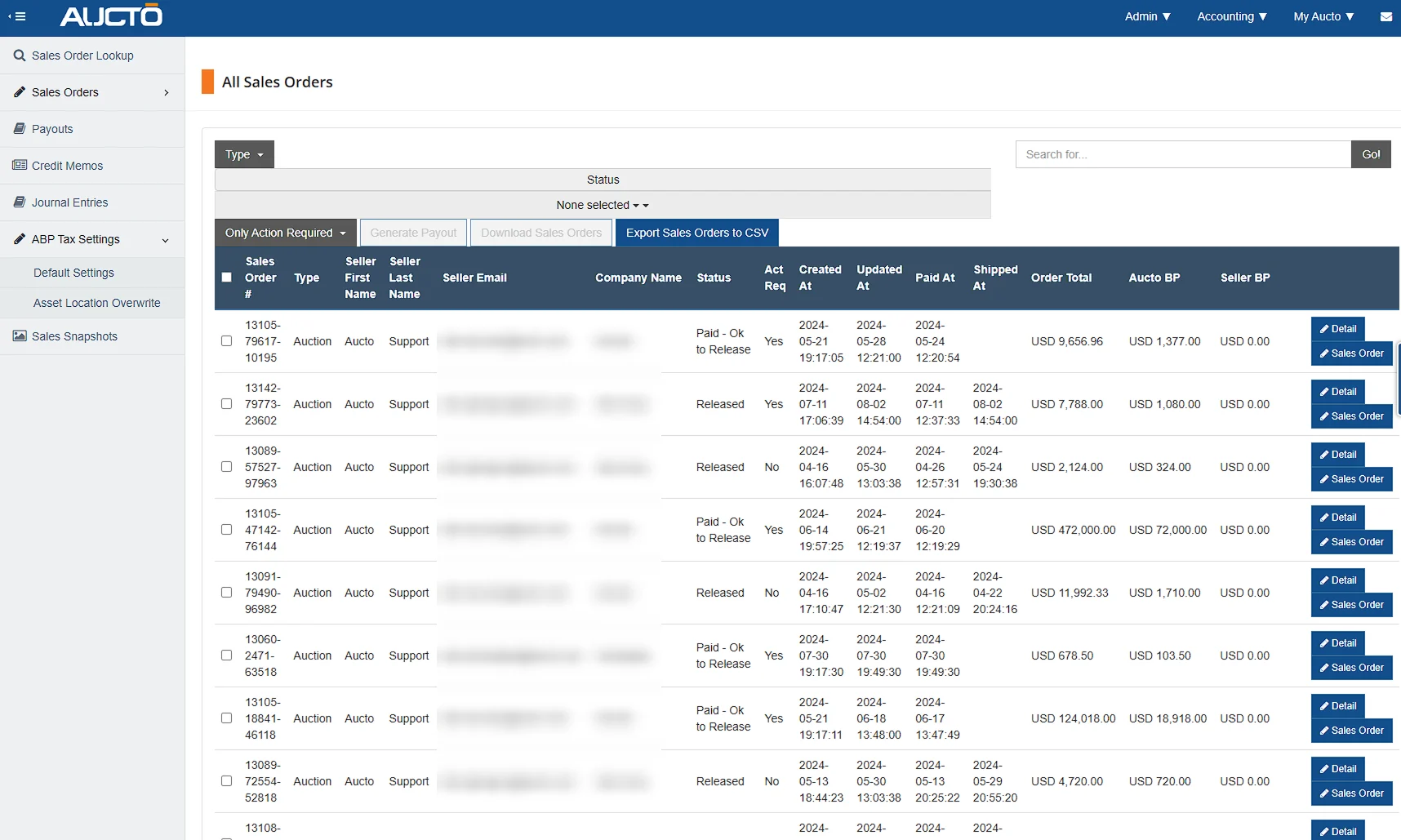
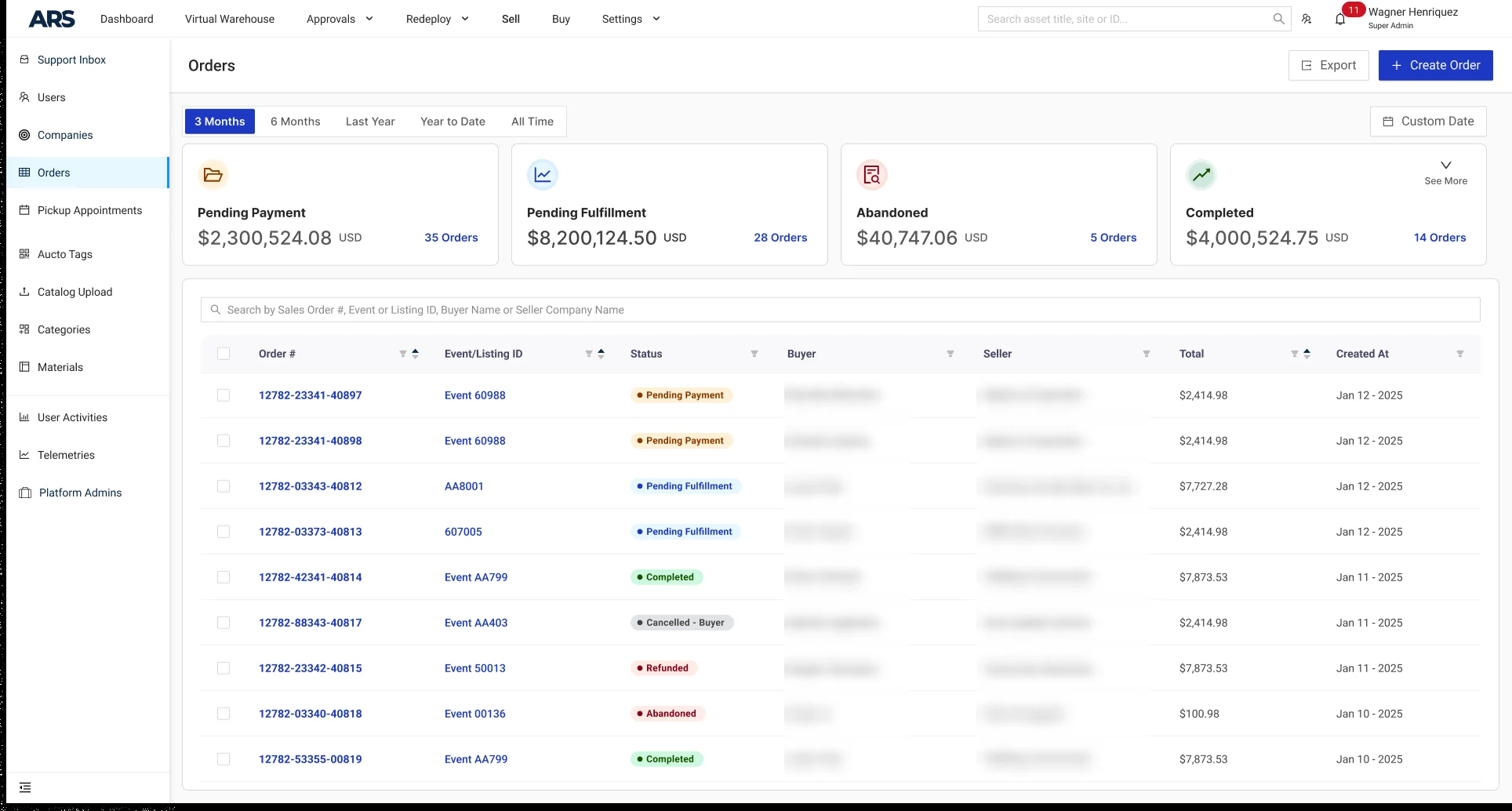
Four cards across the top: pending payment, pending fulfillment, abandoned, completed, each with an amount and a count. That is the question people were opening the list to answer, and they were answering it by scanning a table. Now the table is for finding one order, and the cards are for knowing where the money is.
06The flow
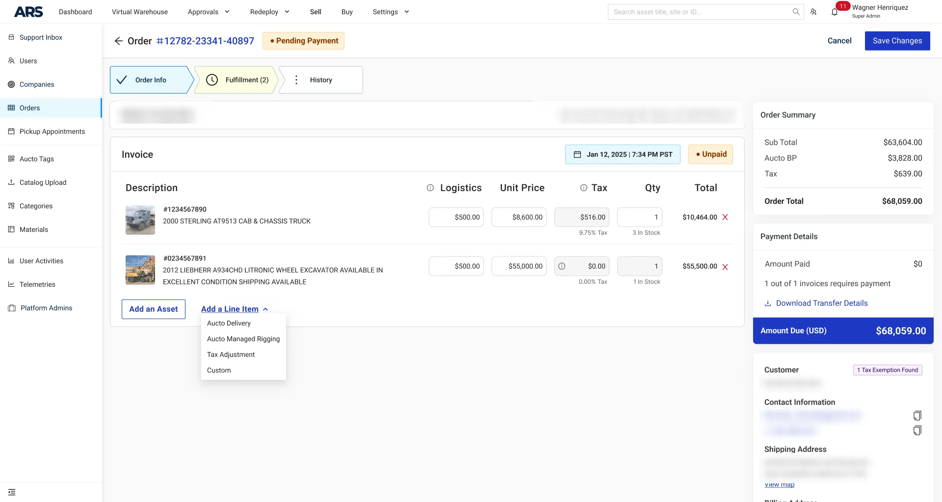
An invoice is not read, it is edited. Somebody has to add the rigging, correct a tax exemption, put in the delivery the customer agreed to on the phone. On the old platform that meant a different screen, sometimes a different system.
Here it happens in place. The page turns editable where it stands: the same rows, now inputs, and two buttons that were not there before.
Add a Line Item opens the four things that get added in practice: Aucto Delivery, Aucto Managed Rigging, Tax Adjustment, Custom. Not a blank row to fill in from memory, the four answers people actually need, and one escape hatch for the fifth.
And then the asset picker, which is where most of the time was going. On the old platform you chose the asset from a dropdown: one list, every lot in the auction, plain text and nothing else. That is fine until the names repeat, and in this business they repeat constantly. One seller clears one plant and lists a dozen machines with nearly identical titles: same year, same manufacturer, same model, a different unit. Picking the wrong one is not a typo, it is an invoice sent to a customer for the wrong machine.
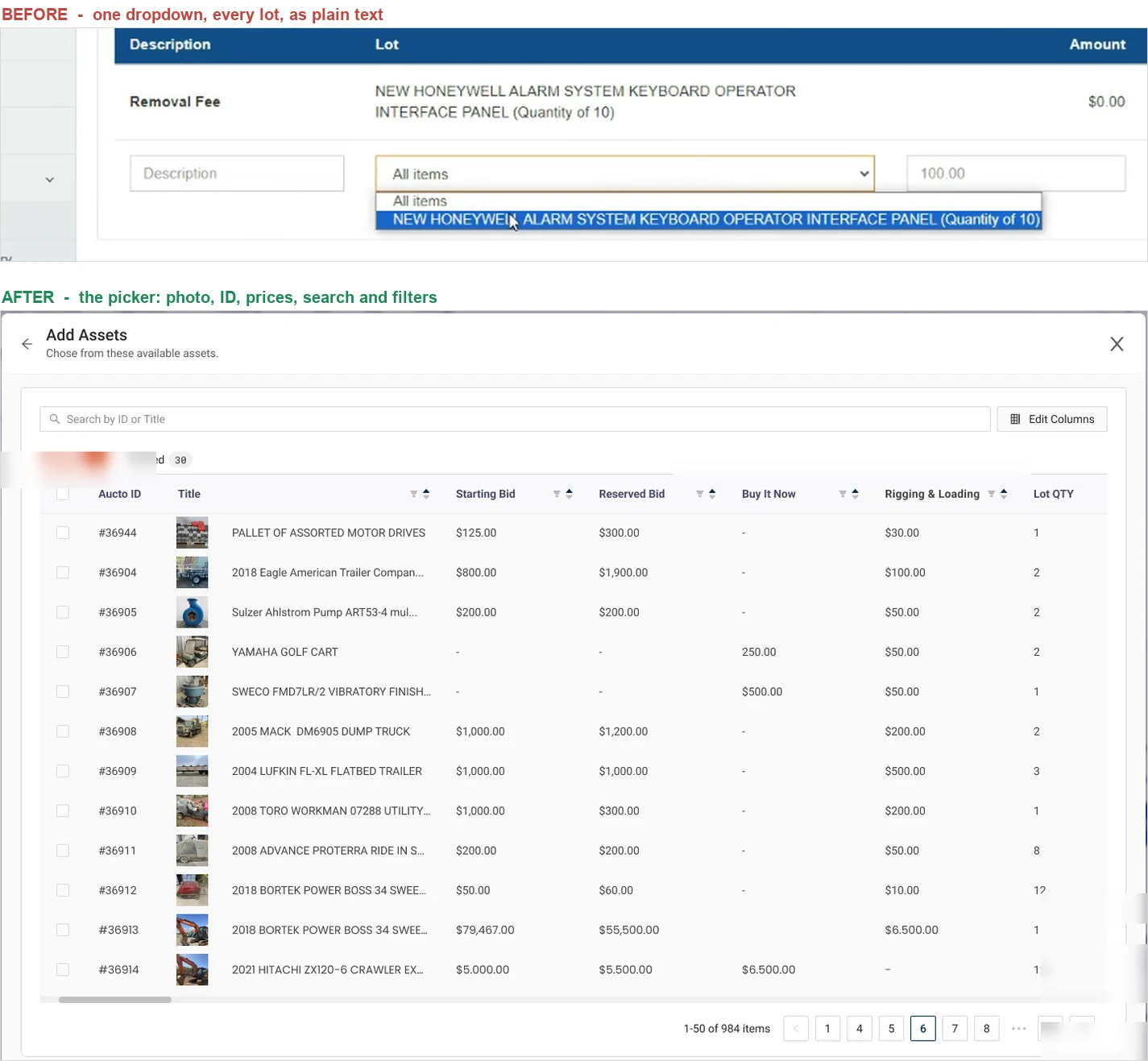
So the dropdown became a picker: every asset in the event, each with its photo, its ID, its starting bid and its reserve, searchable and filterable by column. The photograph is doing the work the text could not do. This is the single change that moved the clock most, and it is not a feature. It is the same list, shown so a person can tell one row from the next.
And then the part I care about most, which is the part nobody notices when it works: the totals recalculate on every keystroke, and they land exactly.

That sounds like a small thing to be proud of. It is the opposite. This is an accounting screen, and the person editing it is about to tell a customer what they owe. A total that lags by one keystroke is worse than no total at all, because it is confidently wrong. Recalculating live is a promise that what you are looking at is what you are about to save.
07The states
An internal tool is not the happy path. It is the other paths: the order that is missing a document, the price somebody typed wrong, the connection that dropped halfway through saving.
This is the part of the work nobody puts in a portfolio, and it is most of the job.
08Project outcomes
Completing an invoice takes half as long. 6 to 12 minutes became 3 to 6, depending on how many assets it carries. The simplest orders went from 4 minutes to 2, which is the part I trust most: a ratio that holds at both ends is a ratio you can believe.
3 minutes sounds like nothing until you count auctions. A full auction is comfortably more than 36 orders, so halving each one gives back between 2 hours and half a working day, per auction, to the same small team.
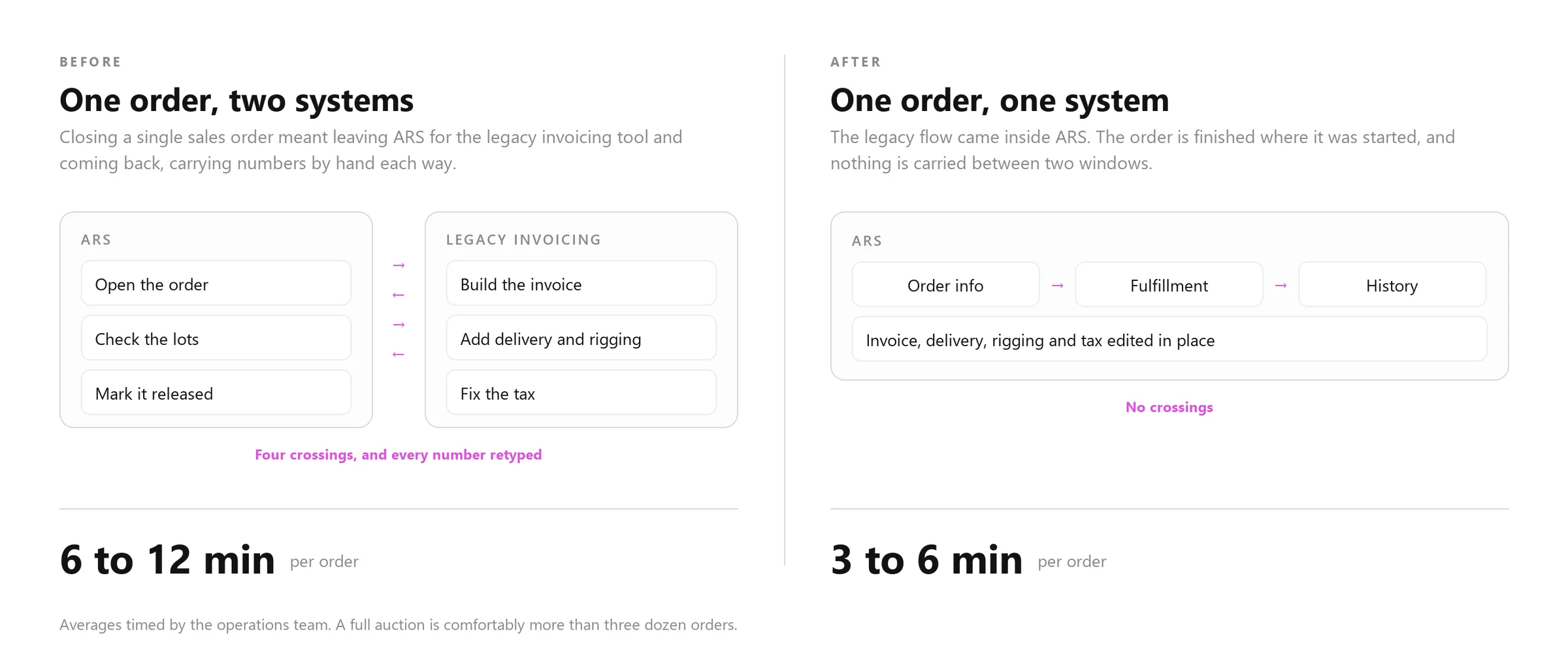
And the reason is structural, not cosmetic. Part of the saving is fewer clicks. The larger part is the diagram above: the flow stopped straddling two systems. The legacy infrastructure came inside ARS, so an order is finished where it was started and no number gets carried between two windows by hand.
That is the difference between a redesign that shaves seconds and one that halves the job. You do not get half back by making a table prettier. You get it back by removing a border between two systems that a person was crossing four times per order.
09What I learned
On an internal tool, subtraction is the risky move. Every field belongs to somebody who is not in the room. I got the same result by changing what the page is about rather than what it contains, and that is a trade I would make again.
The fastest screen is the one you never leave. The biggest single win here was not a layout. It was ending a trip to another system. Before redrawing anything, I now ask what people have to leave the product to do.
Small numbers become big ones through repetition. 3 minutes is nothing and dozens of orders a day is everything. Internal tools are where that multiplication lives, which is exactly why they are worth a designer’s time.
10Also built
In 2026 the marketplace grew two new ways to sell: Buy Now and Best Offer. Neither of them comes from an auction, and that quietly breaks the assumption everything above rests on. There is no closing timer, so there is nothing for the system to generate an invoice from. Somebody starts from an empty page.
Correcting a document and writing one are not the same job, and the screen in this case was built to correct. So the next one is being drawn to write: the form on the left, the finished invoice on the right, redrawing as it is filled in, with the seller’s own logo on the document the customer actually receives.
And the Sales Order is one screen out of a platform. Over these years the work ran across most of ARS: the public marketplace and the listings on it, the asset page a buyer bids from, the virtual warehouse that holds the inventory, the ticket that puts an asset into it, and the thread where a buyer asks the seller a question. Not every piece of that can carry its own case study, so here is the rest of it, a second at a time.